Off-canvas navigation
Off-canvas navigation is a design pattern where the main navigation menu is initially hidden off-screen and can be revealed by a user action, typically by clicking a menu icon or swiping from the edge of the screen. This pattern is particularly useful for mobile interfaces or desktop applications where screen real estate is at a premium.
Benefits and Use Cases
Maximizes screen space. By hiding the navigation off-screen, more space is available for content.
Example
In Cluster's mobile interface, use an off-canvas menu to house the full navigation, leaving more room for content display in the main view.
Provides comprehensive navigation. Off-canvas menus can accommodate longer lists of navigation items without cluttering the main interface.
Example
Include all of Cluster's features and tools in an off-canvas menu, organized into categories like "Content Creation," "Collaboration," and "Analytics."
Supports responsive design. This pattern works well across different screen sizes, from mobile to desktop.
Example
On larger screens, Cluster could use a visible sidebar for navigation, which transforms into an off-canvas menu on smaller screens.
Offers contextual options. Off-canvas areas can be used for more than just navigation, providing space for contextual tools or information.
Example
In Cluster's content editor, use an off-canvas panel to display formatting options, revision history, or collaboration tools.
Psychological Principles Supported
Out of Sight, Out of Mind. Hiding complex navigation reduces cognitive load when users are focused on main tasks.
Example
Keep Cluster's main navigation bar sticky at the top of the page, providing a stable reference point as users scroll through content.
Immediacy. Quick access to navigation supports the principle of immediate action, enhancing user efficiency.
Example
Use a fixed floating action button in Cluster for quick content creation, always accessible regardless of scroll position.
Spatial Constancy. Fixed elements support users' spatial memory, allowing them to build muscle memory for frequently used actions.
Example
Maintain a consistent location for Cluster's search function in a sticky header, allowing users to quickly access it without thinking.
Implementation Guidelines
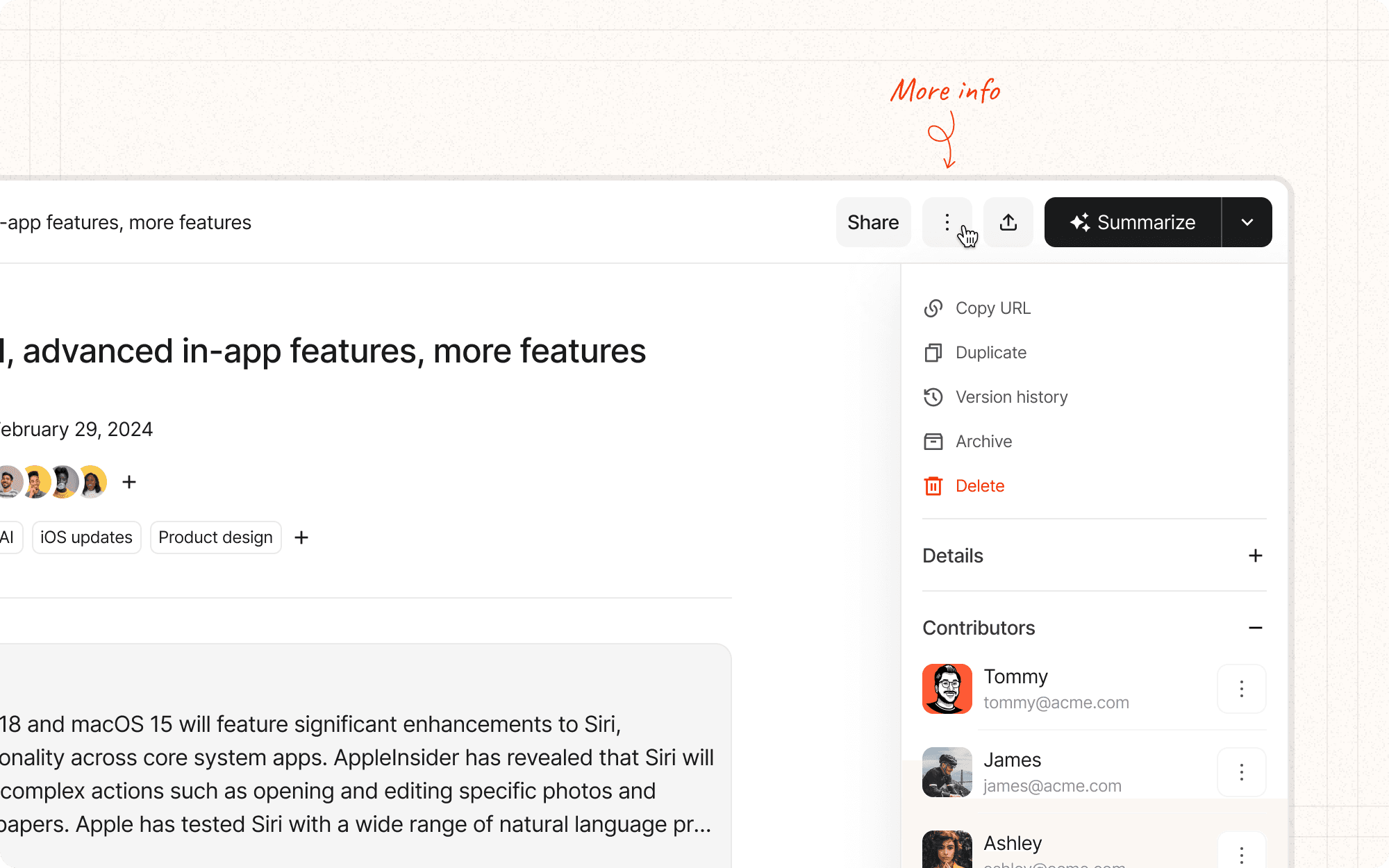
DON'T
Make everything sticky or fixed; prioritize only the most important navigation elements
Allow sticky/fixed elements to cover important content or interactive elements
Forget to provide a way to hide sticky/fixed navigation if it becomes obtrusive
Use sticky/fixed navigation inconsistently across similar pages or sections
Neglect to consider how sticky/fixed elements interact with form inputs, especially on mobile keyboards
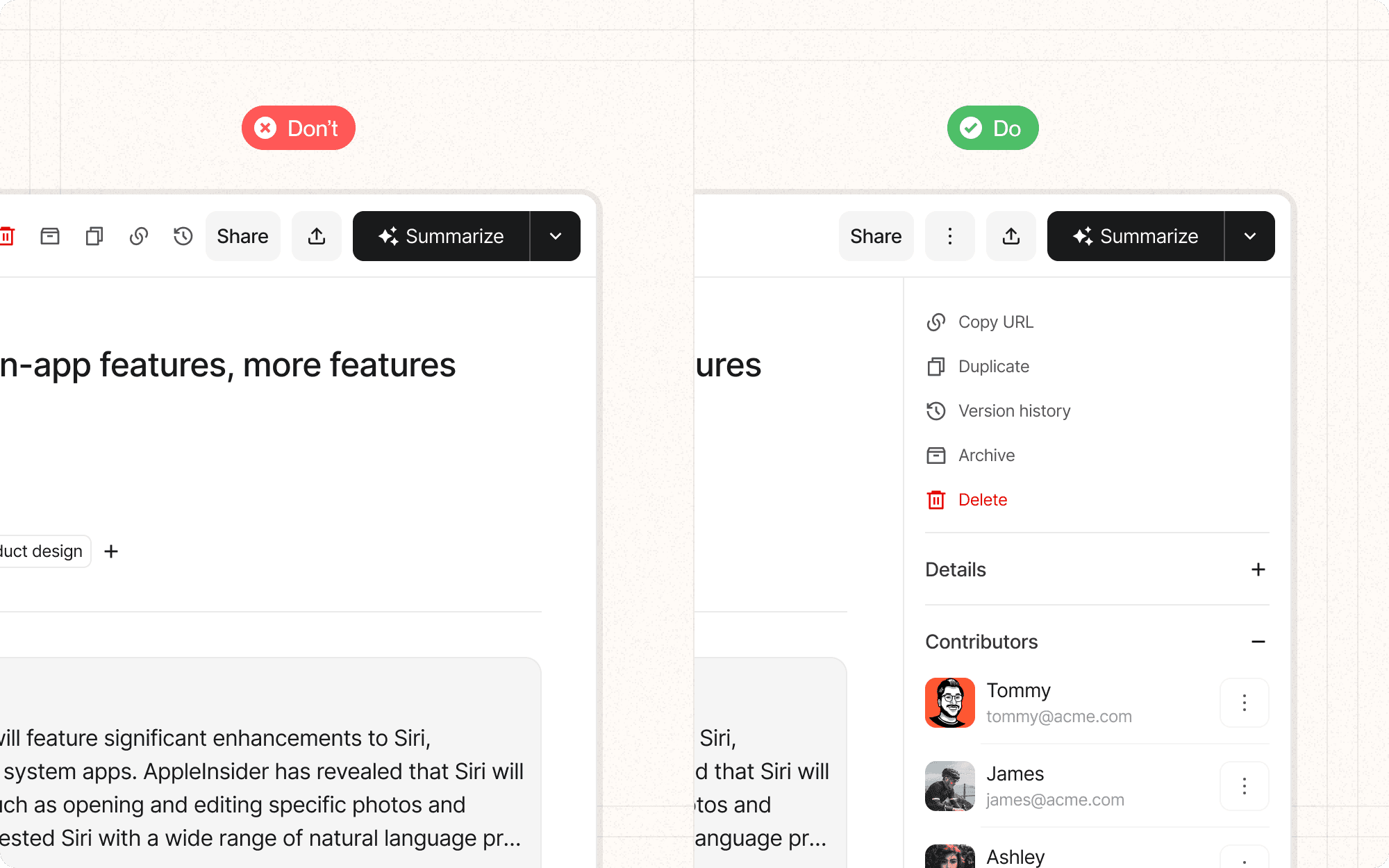
DO
Choose between sticky and fixed navigation based on the specific needs of your interface and content
Ensure sticky/fixed elements don't occupy too much screen space, especially on mobile
Provide clear visual distinction between sticky/fixed elements and scrollable content
Consider using transparency or reducing the size of sticky elements as users scroll to minimize content obstruction
Test the performance impact of sticky/fixed elements, especially on lower-end devices