Priority and progressive navigation
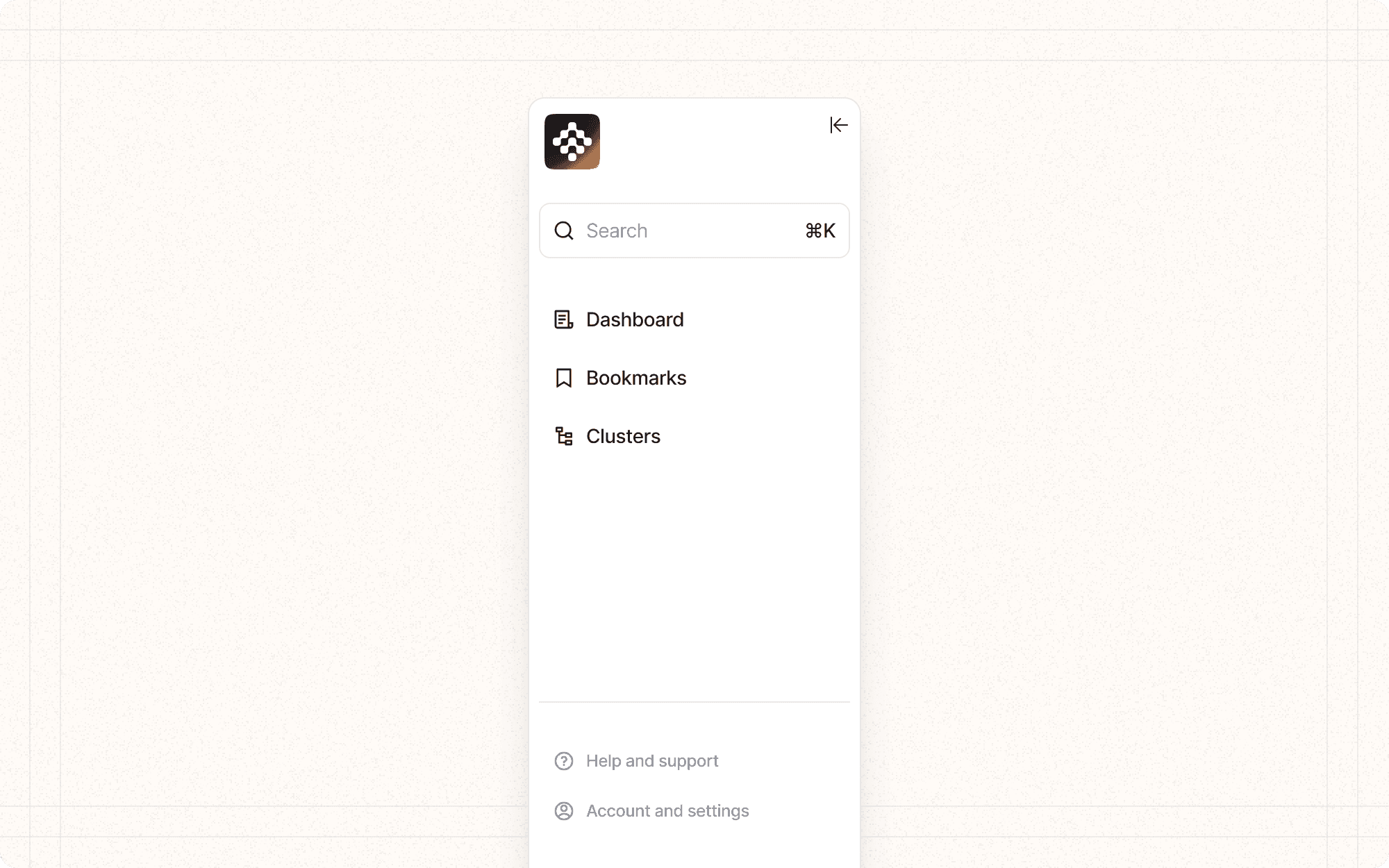
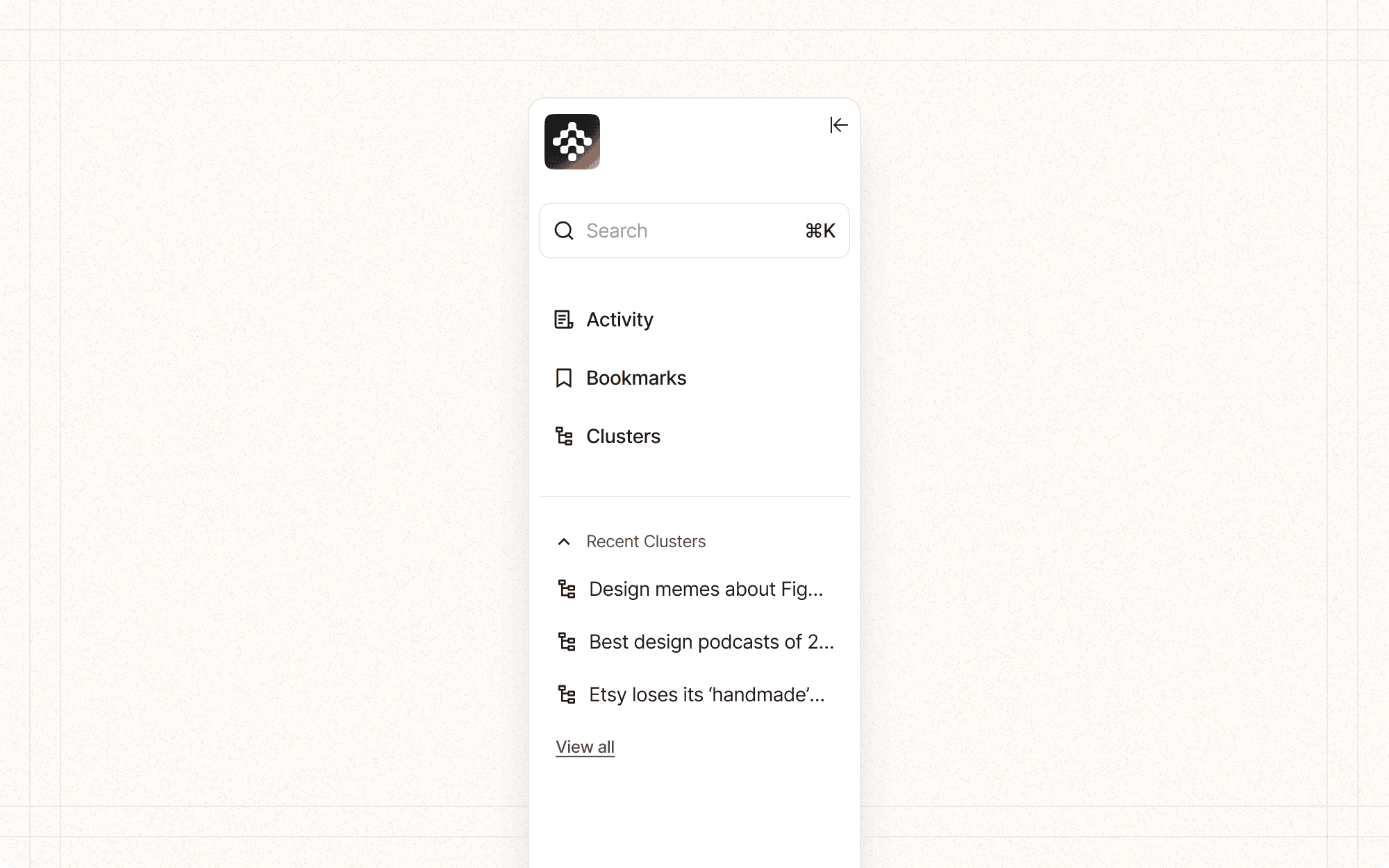
Priority and progressive disclosure in navigation is a technique that organizes and reveals navigation options based on their importance and relevance to the user's current context. This approach helps manage complex navigation structures by showing the most important or frequently used items upfront, while keeping less common options accessible but initially hidden.
Benefits and Use Cases
Reduces cognitive load. By presenting fewer options initially, users aren't overwhelmed with choices.
Example
In Cluster's main navigation, show top-level categories like "Projects" and "Analytics," with subcategories revealed on hover or click.
Improves usability for new users. Essential functions are immediately visible, while advanced features are discoverable as users become more familiar with the system.
Example
Display basic content creation options prominently in Cluster, with advanced AI-powered features accessible through a "More" dropdown.
Enhances efficiency for power users. Frequently used items are easily accessible, while less common actions are available when needed.
Example
In Cluster's content editor, show common formatting options upfront, with advanced layout and styling tools in an expandable panel.
Adapts to different screen sizes. This approach supports responsive design by allowing complex navigation to be condensed on smaller screens.
Example
On mobile devices, collapse Cluster's full navigation into a hamburger menu, with primary actions still visible as bottom navigation icons.
Psychological Principles Supported
Hick's Law. Reducing the number of initial choices decreases decision time and cognitive load.
Example
In Cluster's dashboard, present the most used project types upfront, with a "More" option to access less frequently used templates.
Progressive Disclosure. Revealing information gradually helps users build a mental model of the system without being overwhelmed.
Example
When creating a new content piece in Cluster, start with basic options, then offer advanced settings like AI-assisted writing as the user progresses.
Recognition over Recall. Visible navigation options support recognition memory, reducing the need for users to remember where features are located.
Example
Use clear, descriptive labels and icons in Cluster's navigation to help users quickly recognize and find the features they need.
Implementation Guidelines
DON'T
Replace main content or convey critical information in tooltips
Overuse tooltips or they will lose their value
Allow tooltips to obscure other important content or go off-screen
Use jargon or overly technical terms in tooltip content
Have tooltips appear too quickly on hover to avoid unintentional triggers
Hide tooltips too quickly after the user moves away
DO
Keep content concise and supplement the main content
Make tooltips discoverable with visual cues like underlines or icons
Position tooltips and popovers close to the trigger element
Provide a clear close button or behaviour for popovers with a lot of content
Use plain language that is easy for your audience to understand
Ensure tooltips can be triggered via keyboard focus for accessibility


