Color contrast
Color contrast refers to the difference in light between foreground (usually text) and background colors. Sufficient color contrast is crucial for readability and accessibility, especially for users with visual impairments or color vision deficiencies.
Benefits and Use Cases
Improves readability for all users, especially in varying lighting conditions.
Example
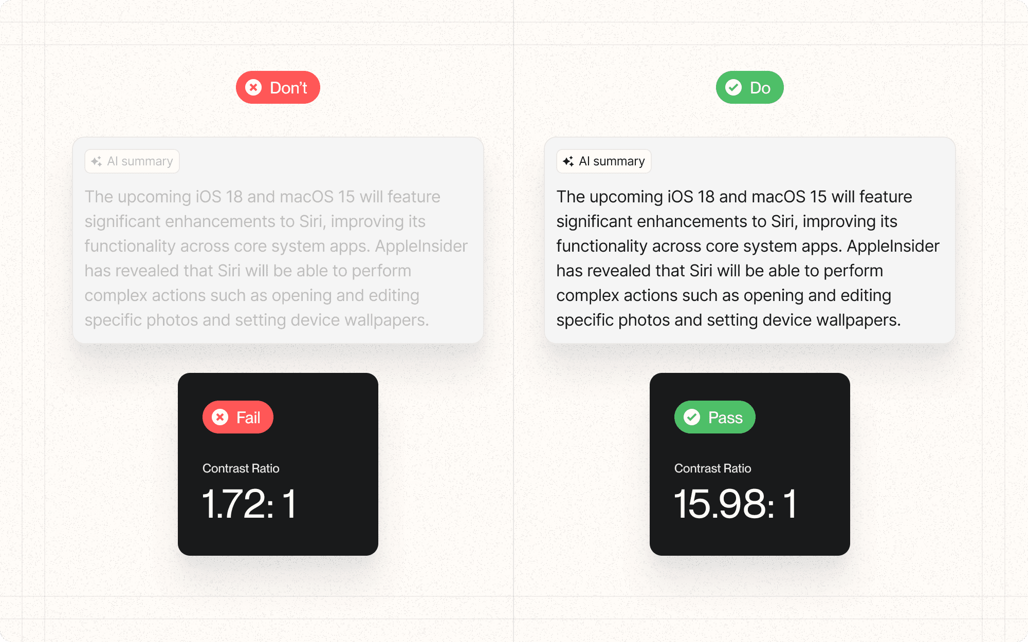
In Cluster, ensure that all text, including labels and button text, has a contrast ratio of at least 4.5:1 against its background.
Enhances usability for users with visual impairments or color blindness.
Example
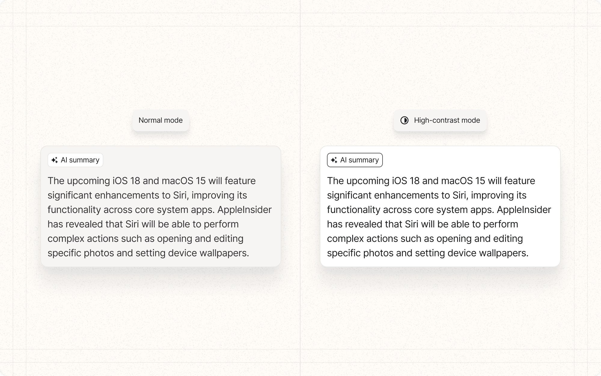
Implement a high-contrast mode in Cluster that users can toggle on, which increases contrast ratios even further for better readability.
Supports users viewing screens in bright sunlight or on low-quality displays.
Example
For Cluster's mobile interface, test and adjust color contrast to ensure readability in outdoor lighting conditions.
Helps maintain brand consistency while ensuring accessibility.
Example
Develop a color palette for Cluster that includes accessible color combinations for all primary interface elements while staying true to the brand.
Psychological Principles Supported
Readability. High contrast supports the principle of easy information processing, reducing cognitive load.
Example
In Cluster's content editor, use high contrast for text input areas to reduce eye strain during long writing sessions.
Visual Hierarchy. Contrast can be used to create clear visual hierarchies, guiding users' attention to important elements.
Example
In Cluster's dashboard, use higher contrast for primary actions and important data points to make them stand out.
User Confidence. Clear, easily readable interfaces can increase user confidence and reduce anxiety, especially for users with visual impairments.
Example
Provide a consistent, high-contrast design for all of Cluster's form inputs and error messages to ensure users can confidently interact with and understand the interface.
Implementation Guidelines
DON'T
Rely solely on color to convey important information
Use low contrast for decorative elements that contain essential information
Forget to check contrast for text over images or gradients
Assume that meeting minimum contrast ratios is always sufficient; aim higher when possible
Neglect to test your contrast choices with actual users, including those with visual impairments
DO
Aim for a minimum contrast ratio of 4.5:1 for normal text and 3:1 for large text
Use color contrast checking tools during the design process
Provide a high-contrast mode option for users who need it
Test your color choices with color blindness simulation tools
Consider contrast in all states of interactive elements (hover, focus, etc.)


