Size and scale
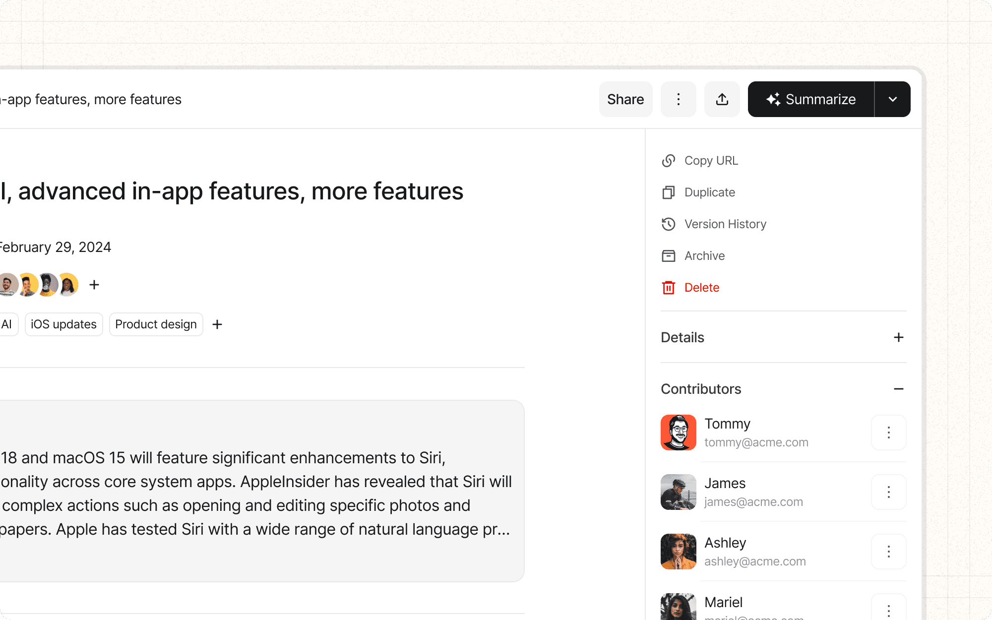
Size and scale are fundamental aspects of visual hierarchy. Larger elements naturally draw more attention and are perceived as more important, while variations in size can create depth and structure in an interface.
Benefits and Use Cases
Directs user attention. Larger elements naturally draw the eye and can be used to highlight important information or actions.
Example
In Cluster, use a larger size for the primary action button (e.g., "Create New Cluster") to make it stand out from secondary actions.
Creates visual hierarchy. Varying sizes of elements can establish a clear order of importance.
Example
Use larger thumbnails for frequently accessed or high-priority content in Cluster's dashboard, and smaller thumbnails for less crucial items.
Improves usability. Appropriately sized elements can make interfaces more user-friendly, especially on touch devices.
Example
Ensure that clickable elements in Cluster's mobile interface are large enough for easy tapping (at least 44x44 pixels).
Enhances visual interest. Varying sizes and scales can create a more dynamic and engaging layout.
Example
In Cluster's content overview, use different sizes for content cards based on their importance or recency to create a visually interesting grid.
Psychological Principles Supported
Visual Saliency. Larger elements are more visually salient and thus capture attention more easily.
Example
In Cluster's analytics dashboard, use larger numbers and charts for key metrics to ensure they're immediately noticeable.
Fitts's Law. Larger targets are easier to interact with, reducing the time and effort required for user actions.
Example
Make frequently used buttons in Cluster, like "Save" or "Share," slightly larger to improve usability.
Information Processing Theory. Varying sizes can help users process information more efficiently by providing visual cues about importance.
Example
In Cluster's content hierarchy, use progressively smaller text sizes for headings, subheadings, and body text to create a clear information structure.
Implementation Guidelines
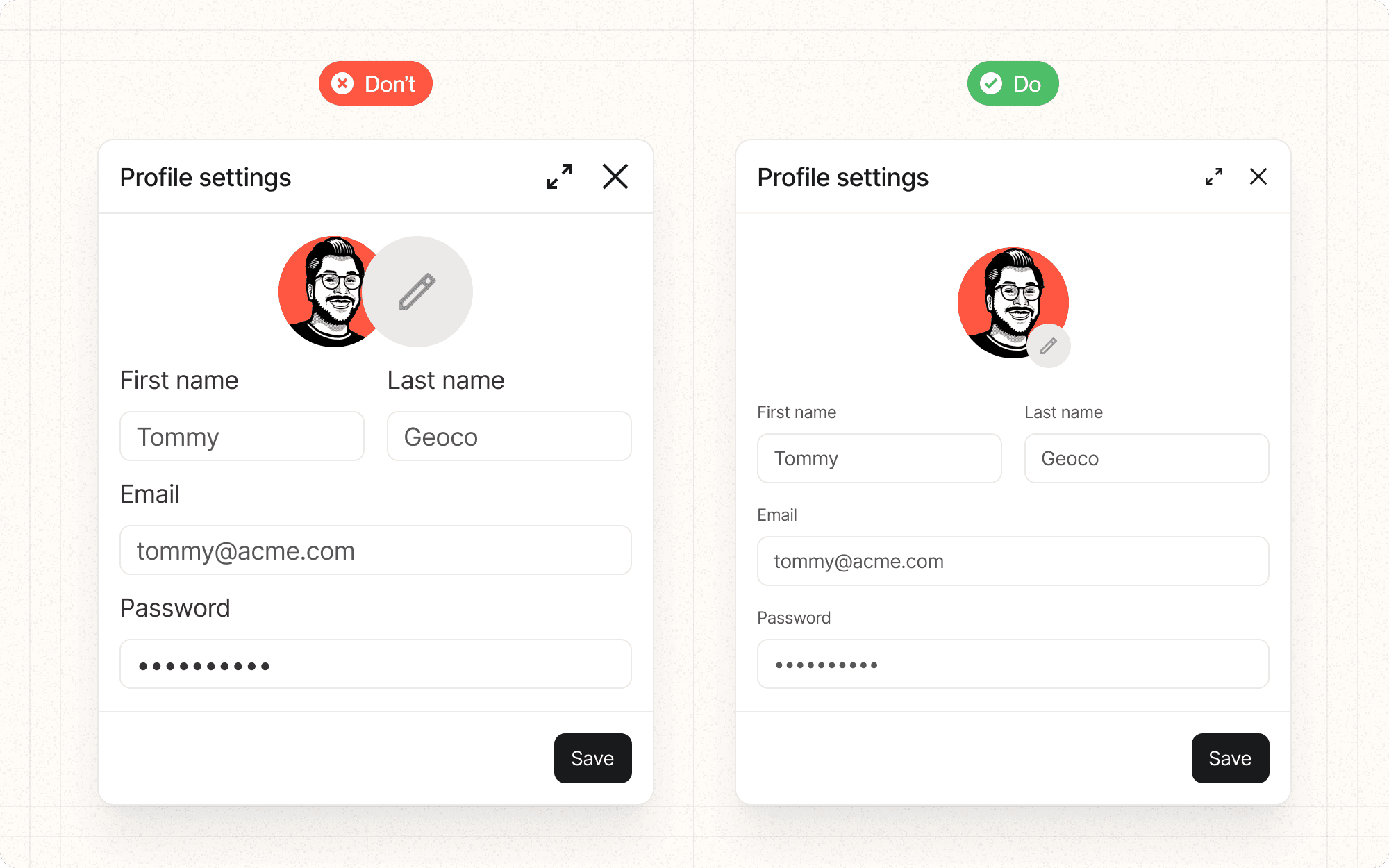
DON'T
Make important elements too small to notice or interact with
Use too many different sizes, which can create visual chaos
Ignore the impact of size on overall layout and composition
Assume that bigger is always better - sometimes subtle size differences are more effective
Forget to consider the relationship between size and other attributes like color and position
DO
Use size consistently to indicate importance across your interface
Ensure that interactive elements are large enough for easy interaction, especially on mobile devices
Consider the balance between different elements when adjusting sizes
Use a sizing scale (e.g., small, medium, large) for consistency
Test your size choices across different screen sizes and resolutions


