Proximity and alignment
Proximity and alignment are key principles in creating a clear visual hierarchy and organizing information effectively. Proximity refers to the spatial relationships between elements, while alignment ensures that elements are ordered and positioned in a visually pleasing and logical manner.
Benefits and Use Cases
Creates logical groupings. Proximity helps users understand which elements are related to each other.
Example
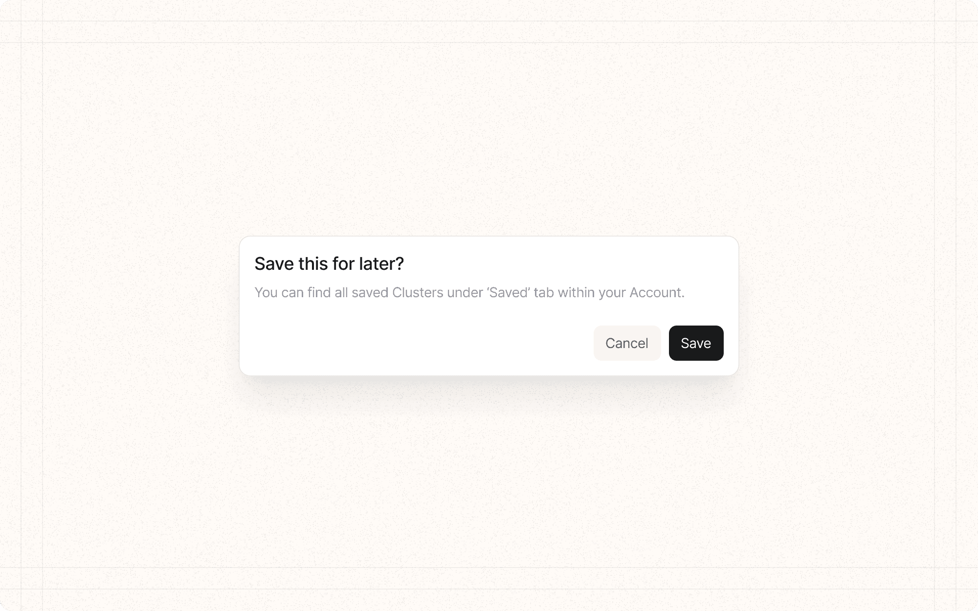
In Cluster's content editor, place formatting options close together and separate them from other tools like save or share buttons.
Improves scanability. Proper alignment creates clean lines that guide the eye, making it easier to scan and comprehend information.
Example
Align all project titles to the left in Cluster's dashboard for easy scanning and comparison.
Enhances aesthetics. Well-aligned elements create a sense of order and professionalism in the interface.
Example
Ensure all elements in Cluster's settings panel are precisely aligned, creating a clean and organized appearance.
Clarifies relationships. Proximity and alignment can show hierarchical relationships between elements.
Example
In Cluster's team management view, use indentation to show hierarchical relationships between team members and their roles.
Psychological Principles Supported
Gestalt Principle of Proximity. Elements that are close together are perceived as related or part of a group.
Example
In Cluster's content organization interface, place related actions (like "Move," "Copy," "Delete") close together to indicate they're part of the same action group.
Gestalt Principle of Continuation. Aligned elements create a sense of order and continuity, guiding the eye through the interface.
Example
Align the titles of all content pieces in a Cluster project, creating a clear line that guides users as they scan through the list.
Law of Prägnanz. Well-organized, aligned interfaces are perceived as simpler and more orderly, reducing cognitive load.
Example
Use consistent alignment throughout Cluster's interface to create a sense of order and simplicity, making the tool feel easier to use.
Implementation Guidelines
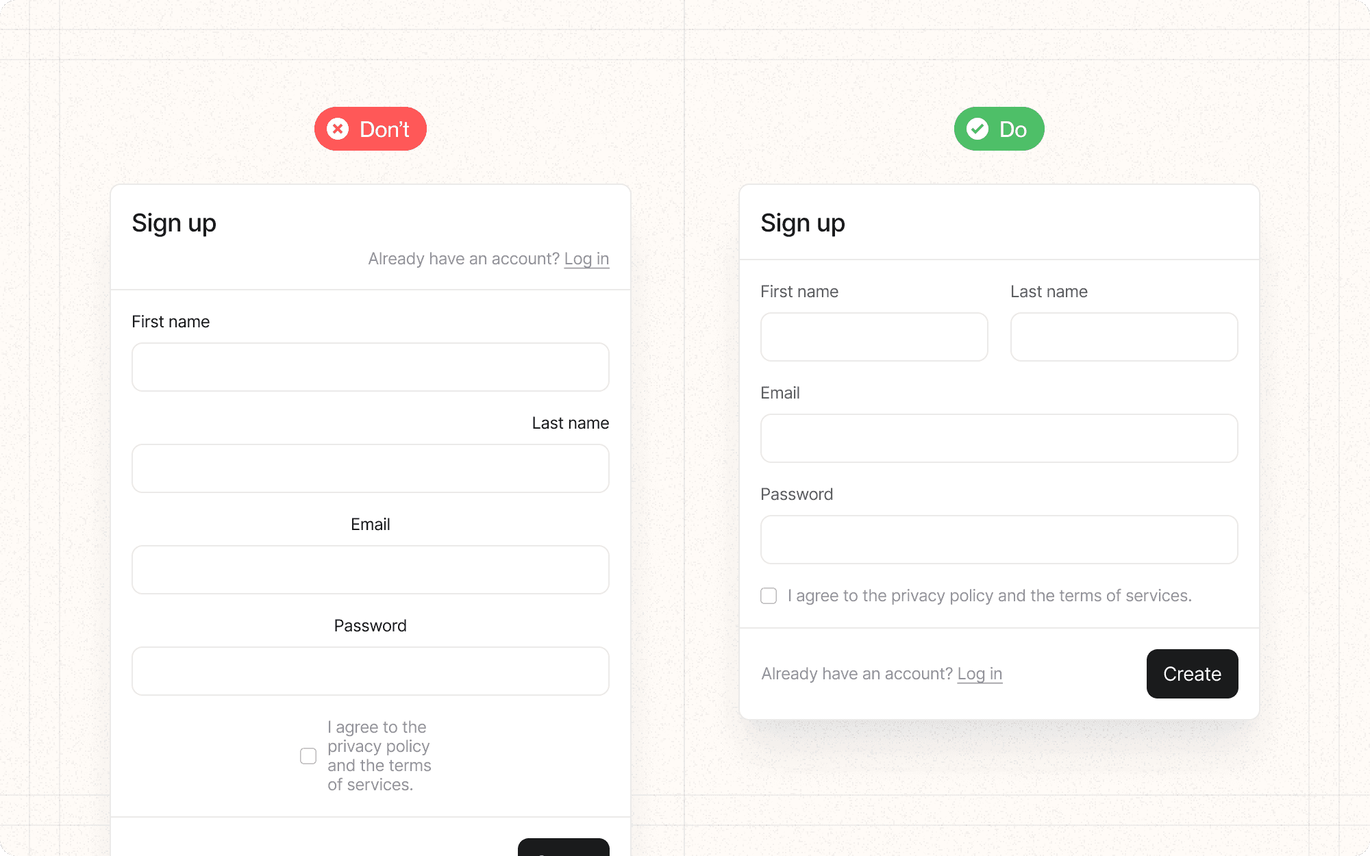
DON'T
Place unrelated elements too close together, which can create false associations
Mix different alignments without a clear purpose, which can create visual chaos
Ignore alignment on smaller elements like icons or buttons
Sacrifice readability for the sake of alignment
Forget to consider how proximity and alignment work across different screen sizes and orientations
DO
Group related elements together and separate unrelated ones
Use consistent alignment throughout your interface (e.g., left-aligned text)
Consider both horizontal and vertical alignment
Use a grid system to ensure consistent spacing and alignment
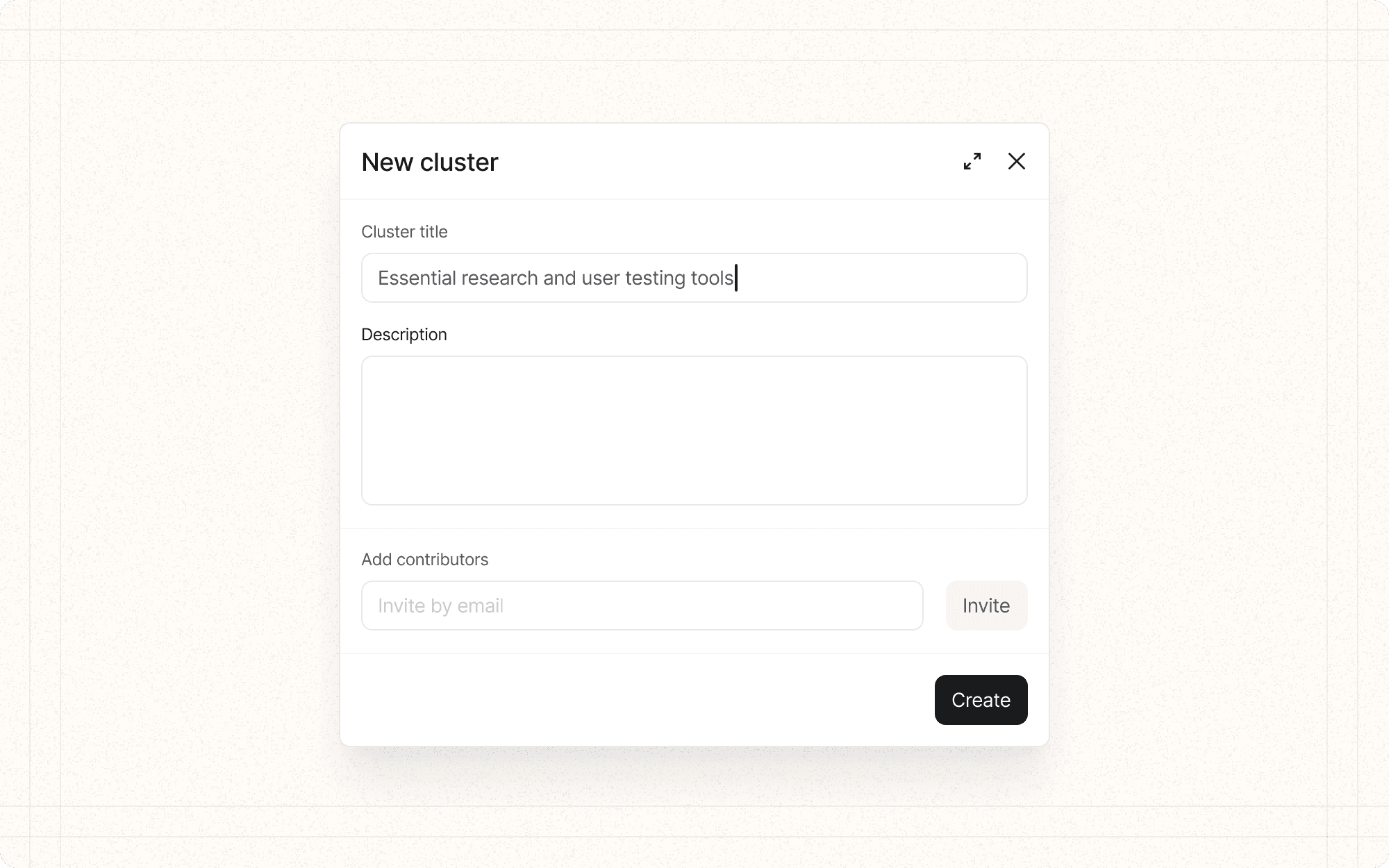
Align form labels and fields to create clear associations


