Whitespace and grouping
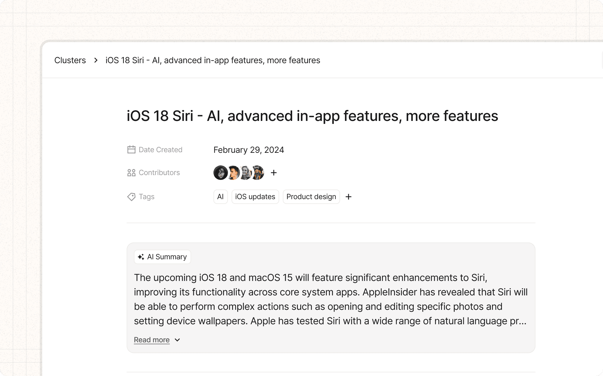
Whitespace, also known as negative space, is the empty area between elements in a design. Effective use of whitespace and grouping can significantly improve the visual hierarchy and overall clarity of an interface.
Benefits and Use Cases
Improves readability. Adequate whitespace around text elements enhances legibility and comprehension.
Example
In Cluster's content editor, use generous line spacing and paragraph margins to improve the readability of long-form content.
Creates visual hierarchy. Strategic use of whitespace can emphasize important elements and create a clear visual structure.
Example
Use more whitespace around Cluster's main action buttons, like "Create New Project," to make them stand out from other interface elements.
Organizes information. Whitespace and grouping help users understand relationships between different elements.
Example
In Cluster's dashboard, use whitespace to clearly separate different project cards, and group related information within each card.
Enhances aesthetic appeal. Proper use of whitespace can make an interface feel clean, modern, and professional.
Example
Implement a spacious, clean layout for Cluster's main interface to create a sense of sophistication and ease of use.
Psychological Principles Supported
Gestalt Principle of Proximity. Elements that are close together are perceived as related, while more space between elements suggests separation.
Example
In Cluster's settings page, group related options closely together and use more whitespace to separate different categories of settings.
Cognitive Load Theory. Well-organized layouts with appropriate whitespace reduce the mental effort required to process information.
Example
Use whitespace to break up long lists of content items in Cluster, making it easier for users to scan and process the information.
Figure-Ground Principle. Proper use of whitespace helps users distinguish between foreground (content) and background, improving focus.
Example
In Cluster's content analysis view, use a subtle background color with ample whitespace around the main content area to help it stand out.
Implementation Guidelines
DON'T
Overcrowd your interface with too many elements
Use inconsistent spacing, which can create visual confusion
Forget to use whitespace in smaller interface elements, like form fields or buttons
Rely solely on borders or lines to group elements when whitespace could be more effective
Sacrifice necessary information just to increase whitespace
DO
Use consistent spacing throughout your interface
Allow for adequate whitespace around important elements or calls-to-action
Use whitespace to create a clear visual hierarchy
Consider how whitespace and grouping will work across different screen sizes


