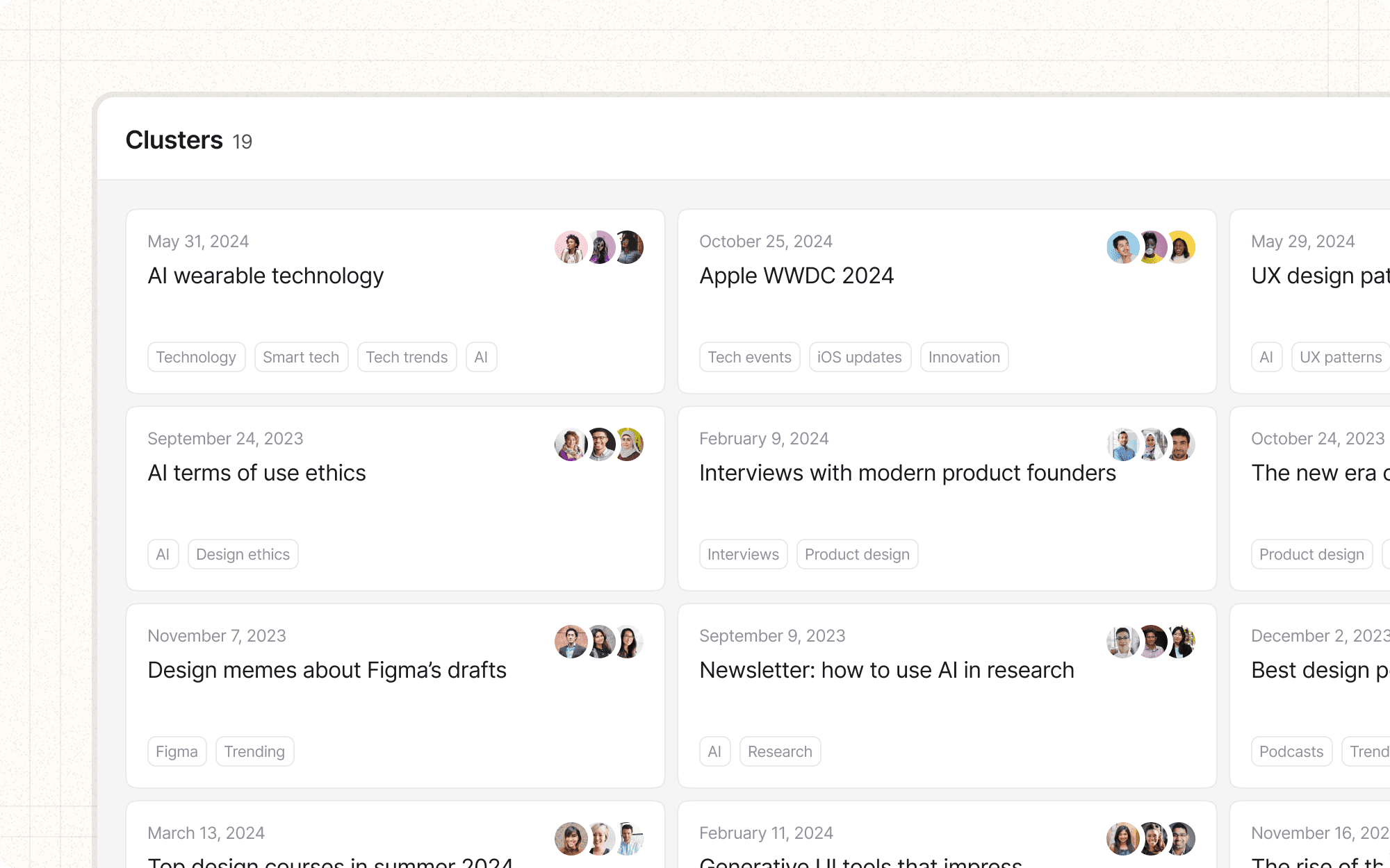
Color and contrast
Color and contrast are powerful tools for creating visual hierarchy in an interface. When used effectively, they can guide users' attention, group related elements, and highlight important information.
Benefits and Use Cases
Guides attention. Strong color contrast can direct users to important elements or calls-to-action.
Example
In Cluster, use a vibrant, contrasting color for the "Generate AI Summary" button to make it stand out from other interface elements.
Creates visual grouping. Similar colors can be used to show relationships between elements.
Example
Use a consistent color scheme for all elements related to content creation in Cluster, visually separating them from administrative features.
Enhances brand identity. Strategic use of color reinforces brand recognition and personality.
Example
Incorporate Cluster's brand colors throughout the interface, using them consistently for specific types of actions or information.
Improves readability. Proper contrast between text and background colors enhances legibility.
Example
Ensure high contrast between text and background colors in Cluster's content editor to improve readability during long writing sessions.
Psychological Principles Supported
Von Restorff Effect. Elements with high color contrast are more likely to be noticed and remembered.
Example
In Cluster's dashboard, use a unique, high-contrast color for new or unread notifications to ensure they catch the user's attention.
Color Psychology. Different colors can evoke different emotions or associations.
Example
Use calming blues and greens in Cluster's writing interface to create a sense of focus and productivity.
Gestalt Principle of Similarity. Elements with similar colors are perceived as related or belonging to the same group.
Example
In Cluster's project view, use similar colors for all elements related to team collaboration, visually grouping them together.
Implementation Guidelines
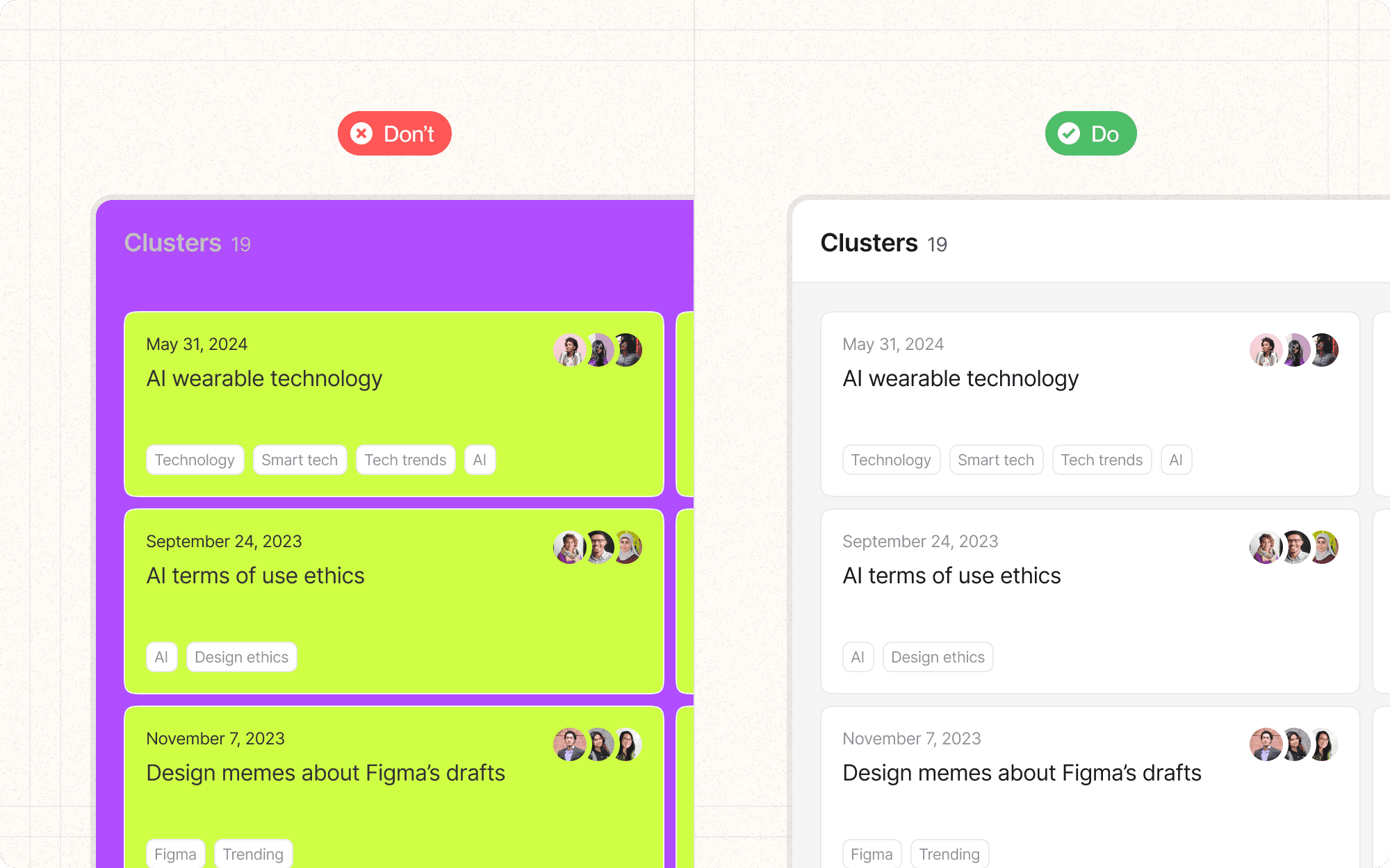
DON'T
Rely solely on color to convey important information
Use too many colors, which can create visual clutter
Choose color combinations that vibrate or create visual discomfort
Forget to test your color scheme under different lighting conditions
Use colors that clash with your brand or create confusion with common UI conventions
DO
Use color purposefully to guide attention and create hierarchy
Ensure sufficient contrast between text and background colors
Create a consistent color scheme that aligns with your brand identity
Use color to differentiate between interactive and static elements
Consider color blindness and other visual impairments in your color choices


