Typography
Typography plays a crucial role in establishing visual hierarchy within an interface. Effective use of typography can guide users' attention, improve readability, and convey the relative importance of different pieces of information.
Benefits and Use Cases
Establishes information hierarchy. Different font sizes, weights, and styles can indicate the relative importance of various text elements.
Example
In Cluster, use a large, bold font for project titles, a slightly smaller font for section headers, and a standard size for body text.
Improves readability. Proper typography enhances the legibility of text, making it easier for users to consume information.
Example
Use a clean, sans-serif font for Cluster's interface text to ensure readability across different screen sizes and resolutions.
Conveys brand identity. Typography choices can reinforce your product's personality and brand.
Example
Select a modern, professional typeface for Cluster that aligns with its identity as an innovative content management tool.
Guides user attention. Strategic use of typography can direct users to important information or calls-to-action.
Example
Use a distinct, attention-grabbing typography style for Cluster's "Create New Project" button to make it stand out.
Psychological Principles Supported
Visual Saliency. Distinctive typography draws attention to important elements, leveraging the brain's tendency to notice standout items.
Example
In Cluster's content editor, use a unique typography style for AI-generated suggestions to make them visually distinct from user-written content.
Fitts's Law. Larger text is easier to interact with, especially on touch devices, making important actions more accessible.
Example
Use larger, well-spaced text for clickable elements in Cluster's mobile interface, such as menu items or action buttons.
Cognitive Load Theory. Consistent and well-structured typography reduces the mental effort required to process information.
Example
Maintain consistent typography styles across Cluster for similar types of information (e.g., all project titles use the same style), reducing the cognitive load of interpreting the interface.
Implementation Guidelines
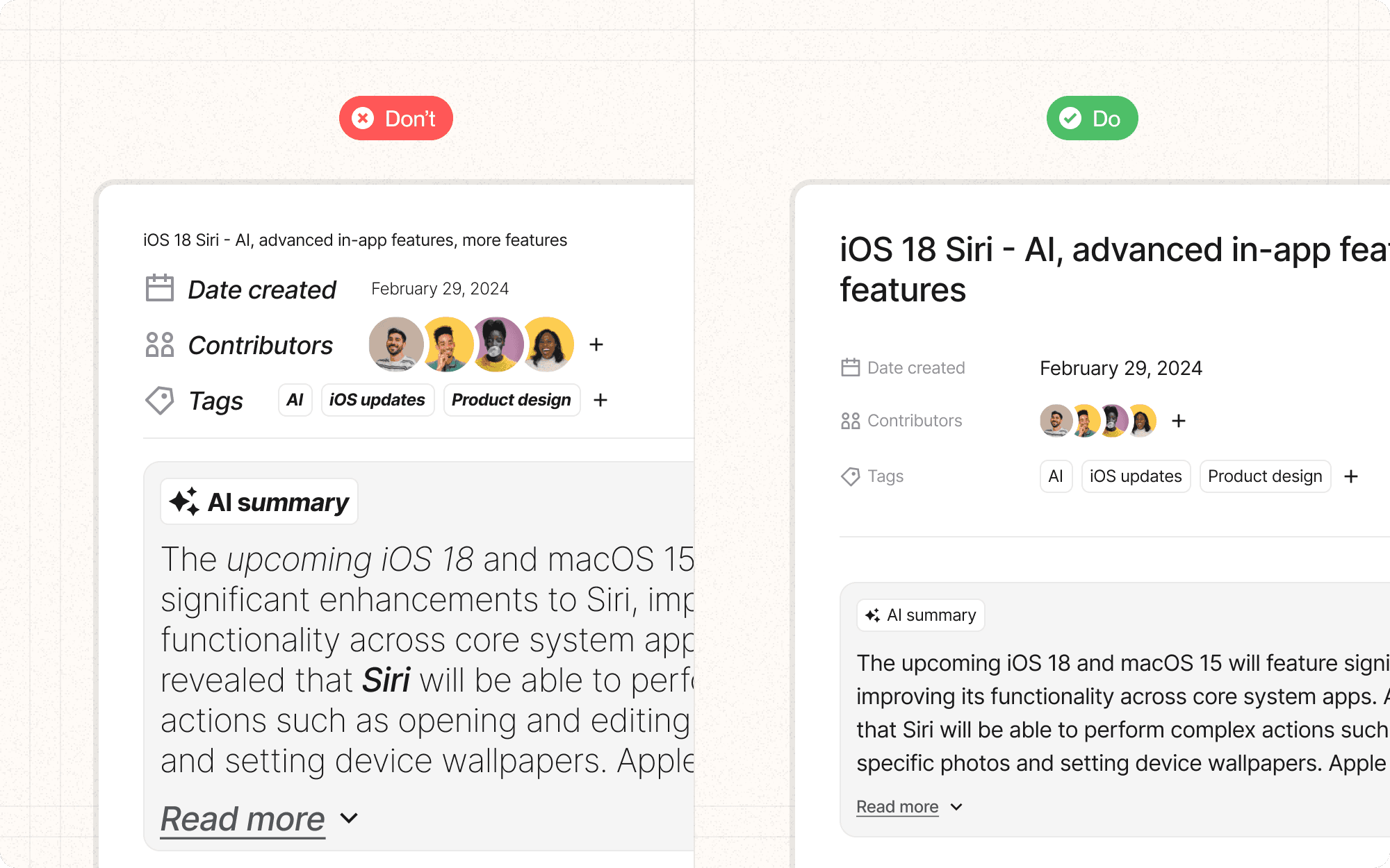
DON'T
Use too many different fonts or styles, which can create visual chaos
Sacrifice readability for aesthetic choices
Rely solely on color to differentiate text, as this can be problematic for color-blind users
Use fonts that are too similar, as subtle differences can be confusing
Forget to test typography across different devices and screen sizes
DO
Establish a clear typographic hierarchy with distinct styles for headers, subheaders, body text, and UI elements
Use font weight, size, and color to differentiate between text elements
Ensure sufficient contrast between text and background for readability
Maintain consistency in typography across your interface
Consider responsive typography that adjusts based on screen size


