Tooltips and popovers
Tooltips and popovers are small containers that display additional information about an element when the user interacts with it. Tooltips appear when hovering over an element and provide brief explanatory text, while popovers are triggered by a click and can contain more detailed information or actions. Both are used to progressively disclose information without overwhelming the user.
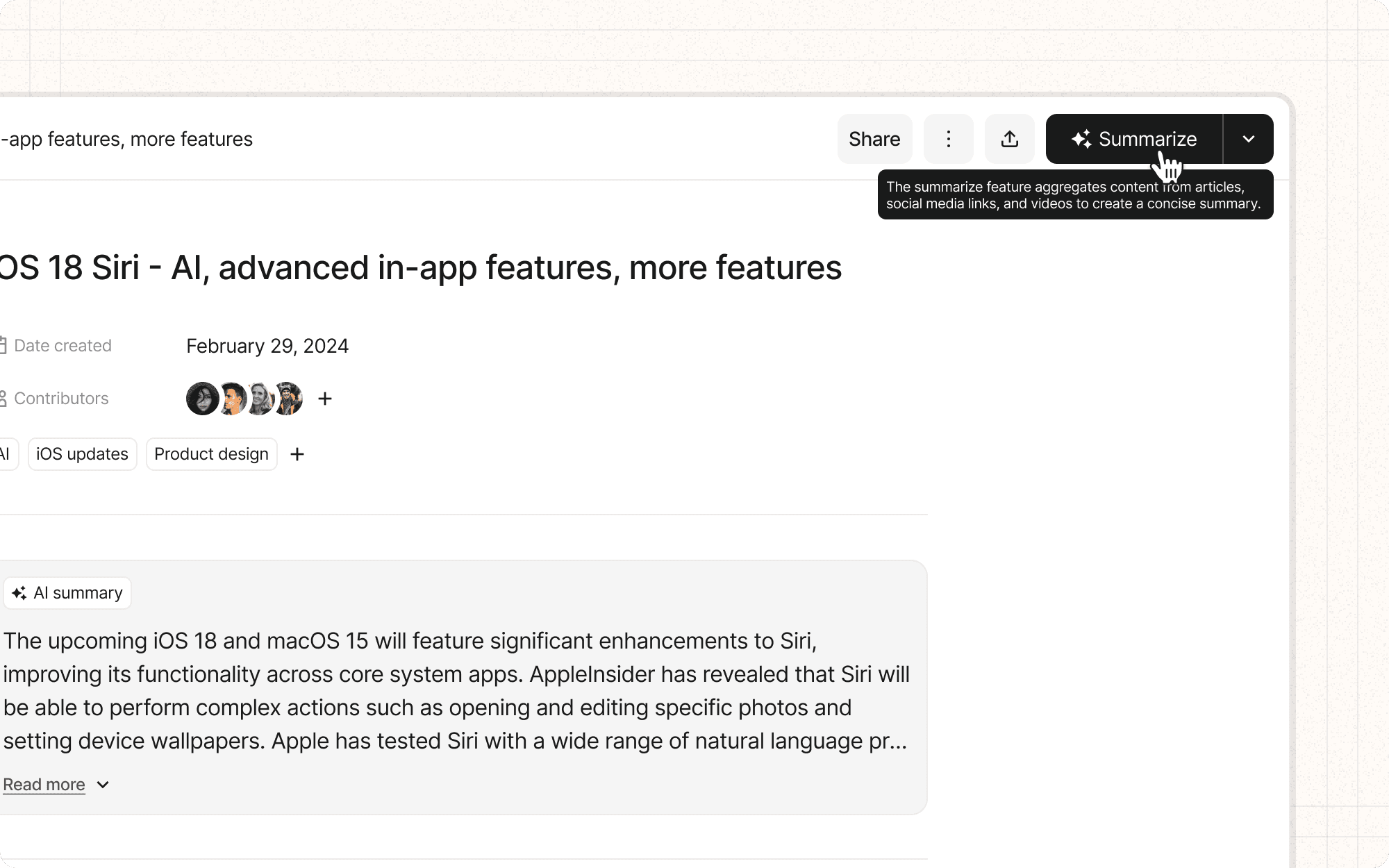
In Cluster, tooltips could be used to explain unfamiliar AI features, while popovers might display detailed information about collaborators or content items without navigating away from the main view.
Benefits and Use Cases
Provides context. Tooltips and popovers provide additional context about an element without taking up valuable screen real estate.
Example
In Cluster, use tooltips to explain AI-powered features like "Auto-summarize" or "Content suggestion" without cluttering the interface.
Reduces cognitive load. By hiding extra information behind a hover or click, users can access it only when needed, reducing the amount of information they need to process at once.
Example
Use popovers in Cluster to display detailed metadata about a content item, such as creation date, author, and tags, only when a user requests more information.
Defining new or complex terms. If your interface includes terminology that may be unfamiliar to users, tooltips can define those terms when hovered over, making the interface easier to learn.
Example
Provide tooltips for AI-related terms in Cluster, such as "semantic analysis" or "natural language processing," to help users understand these concepts.
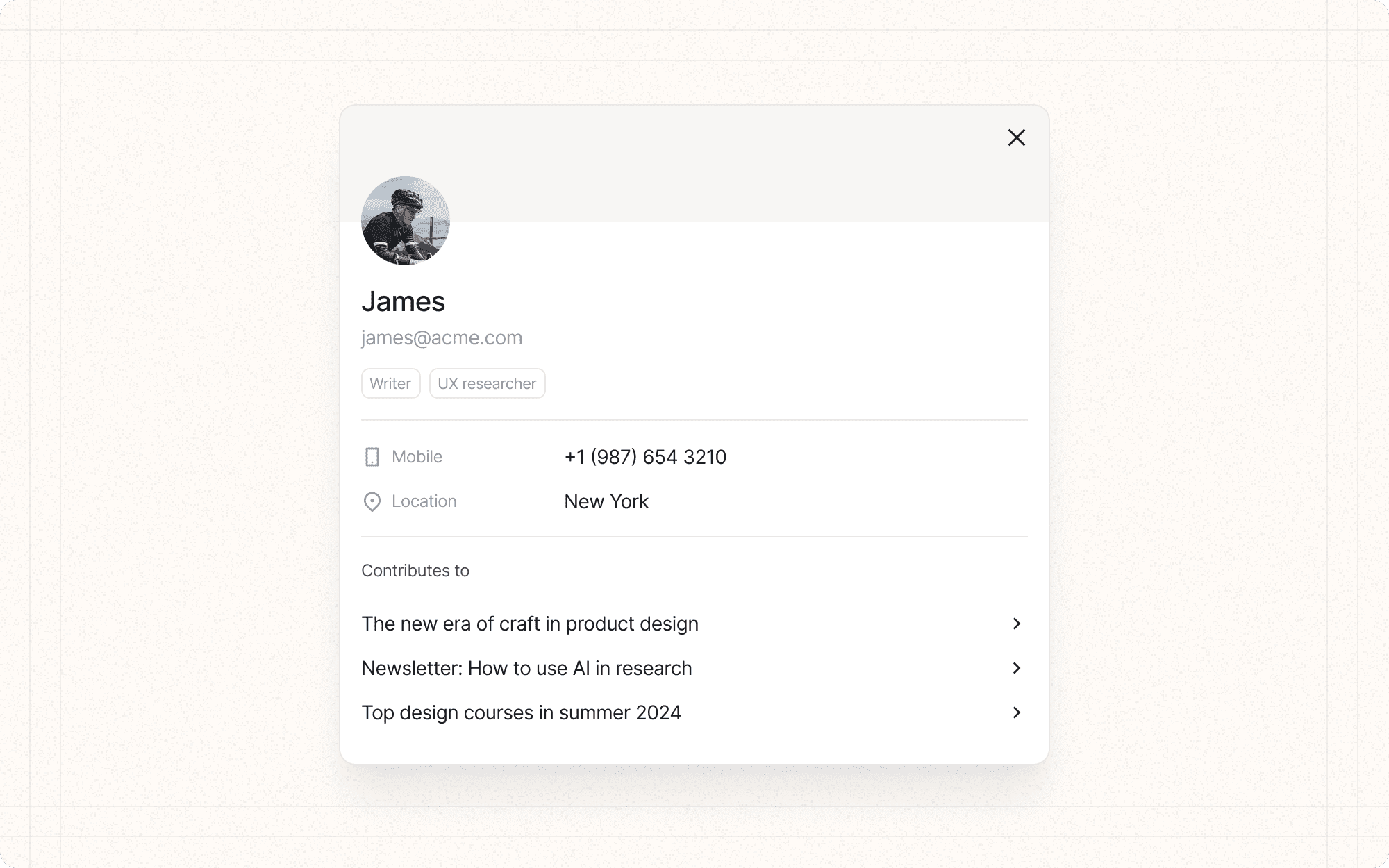
Displaying extra data. Popovers can show additional data related to an element when clicked, such as a mini profile when clicking on a user's name.
Example
In Cluster's collaboration features, use popovers to display team member profiles, including their role, recent activity, and contact information.
Psychological Principles Supported
Filtering. Tooltips allow users to access additional information without cluttering the main interface, helping them focus on the essential details.
Example
In Cluster's content dashboard, use tooltips to provide quick summaries of content items, allowing users to filter relevant information without opening each item.
Recall. By providing definitions or explanations in tooltips, users don't have to remember the meaning of every term, reducing the burden on their memory.
Example
Use tooltips in Cluster to remind users of keyboard shortcuts or the meaning of icons, reducing the need to memorize these details.
Efficiency. Popovers can contain quick actions related to an element, letting users access common tasks without navigating to a separate page.
Example
Implement popovers in Cluster that allow users to quickly edit tags, move content to different clusters, or share items without leaving their current view.
Implementation Guidelines
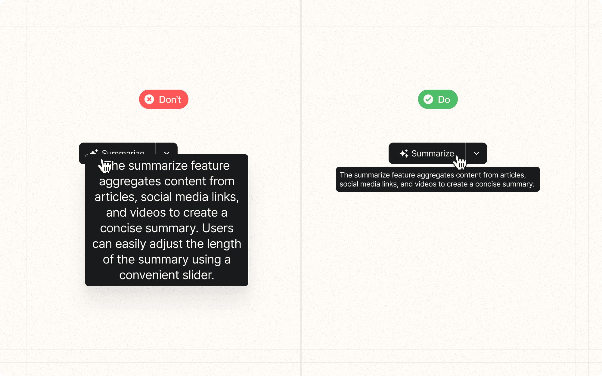
DON'T
Replace main content or convey critical information in tooltips
Overuse tooltips or they will lose their value
Allow tooltips to obscure other important content or go off-screen
Use jargon or overly technical terms in tooltip content
Have tooltips appear too quickly on hover to avoid unintentional triggers
Hide tooltips too quickly after the user moves away
DO
Provide clear navigation controls for manual advancement
Ensure that all items in the carousel or slider are accessible via keyboard navigation
Use appropriate timing for auto-advancing carousels (if used)
Include a visual indicator of the user's position in the sequence (e.g., dots or progress bar)
Optimize the content for the carousel or slider format
Ensure tooltips can be triggered via keyboard focus for accessibility


