Tabs and accordions
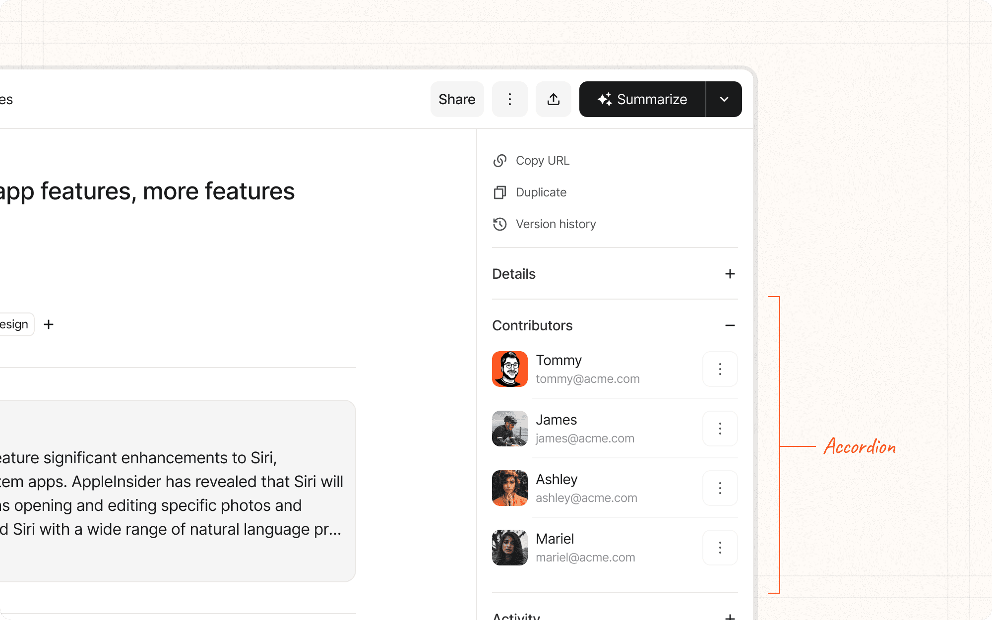
Tabs and accordions are both patterns that allow users to switch between different views or sections of content within the same space. Tabs typically appear as a row of clickable headers, with only one tab's content visible at a time. Accordions are vertically stacked headers that can be expanded or collapsed to reveal or hide their associated content.
Benefits and Use Cases
Organizes related content. Both tabs and accordions group related information, making it easier for users to find what they're looking for.
Example
Use tabs in Cluster to separate different types of content within a project (e.g., "Research", "Drafts", "Published Content").
Saves space. These patterns allow you to present a lot of information in a compact area without overwhelming the user.
Example
Use an accordion in Cluster to display and hide detailed metadata for each content piece, saving space on the main view.
Facilitates comparison. Tabs make it easy for users to switch between different categories of information for comparison.
Example
Implement tabs in Cluster's analytics section to allow users to quickly switch between different metrics views (e.g., "Engagement", "Shares", "Comments").
Provides context. The visible headers in both patterns give users an overview of available content.
Example
Use accordion headers in Cluster to show all available sections of a document, even when some are collapsed.
Psychological Principles Supported
Chunking. Both tabs and accordions break content into manageable sections, aiding in information processing.
Example
In Cluster, use tabs to chunk different stages of the content creation process (e.g., "Ideation", "Writing", "Editing", "Publishing").
Progressive disclosure. These patterns reveal information progressively, reducing cognitive load.
Example
Use accordions in Cluster's settings page to hide advanced options, revealing them only when users choose to expand those sections.
Recognition over recall. The visible headers aid recognition memory, helping users quickly find the section they need.
Example
In Cluster's project view, use clearly labeled tabs for different content categories, allowing users to recognize and select the desired section.
Implementation Guidelines
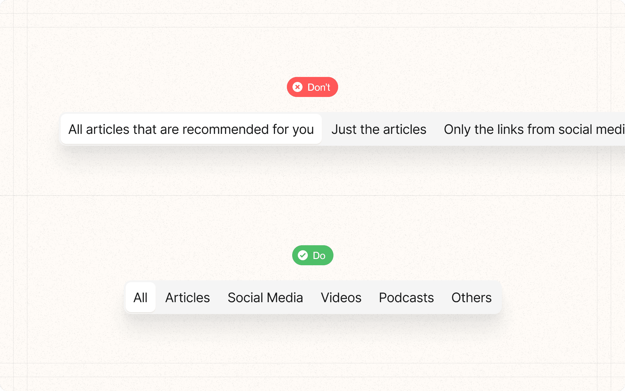
DON'T
Use tabs or accordions for content that users need to see simultaneously
Nest accordions too deeply, as this can become confusing and hard to navigate
Use these patterns for sequential tasks or information that needs to be consumed in a specific order
Overload tabs or accordions with too many sections
Hide critical information or primary actions behind tabs or in collapsed accordions
DO
Use clear, concise labels for tab and accordion headers
Indicate the currently active tab or expanded accordion section
Consider using icons alongside text in tab or accordion headers to enhance recognition
Ensure that the content within each tab or accordion section is cohesive and relevant to the header
Provide smooth transitions when switching between tabs or expanding/collapsing accordions


