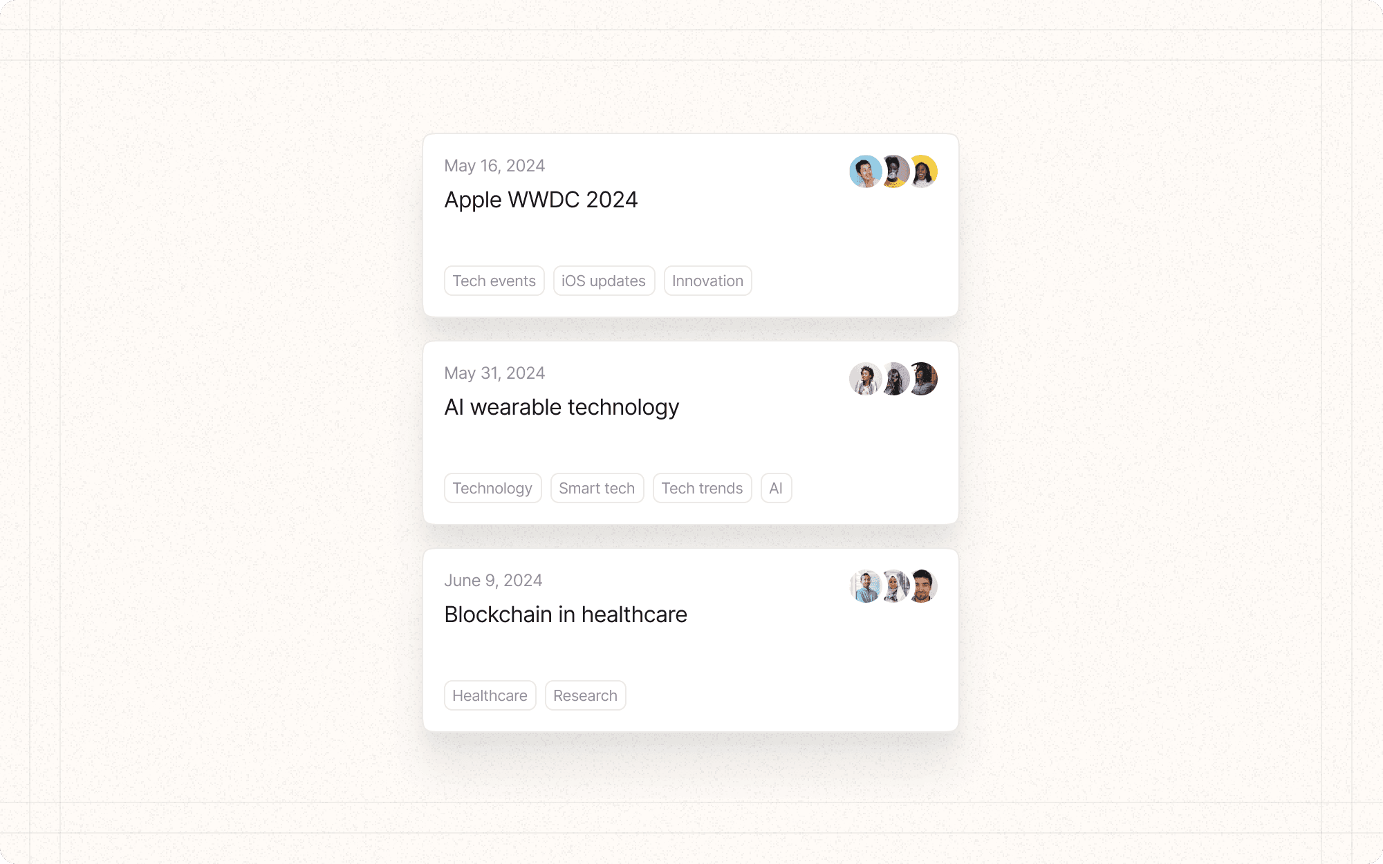
Card-based layouts
Card-based layouts organize content into discrete, rectangular containers that resemble physical cards. This pattern is particularly effective for displaying collections of similar items, such as articles, products, or in the case of Cluster, content pieces or projects.
Benefits and Use Cases
Organizes diverse content. Cards provide a consistent format for presenting various types of content, making it easier for users to scan and compare items.
Example
In Cluster, use cards to display different content clusters, each containing a title, brief description, and key metadata.
Supports responsive design. Cards can easily reflow and resize to fit different screen sizes and orientations.
Example
Cluster's card layout can adjust from a multi-column grid on desktop to a single column on mobile devices.
Facilitates modularity. Cards encapsulate content and functionality, making it easier to add, remove, or rearrange items.
Example
Allow Cluster users to drag and drop content cards to reorganize their dashboard or move items between clusters.
Provides clear interaction targets. Each card acts as a distinct, clickable unit, improving touch interactions on mobile devices.
Example
Make each content card in Cluster tappable to view full details or edit the content.
Psychological Principles Supported
Chunking. Cards naturally break content into discrete, manageable units, aiding information processing and recall.
Example
Each card in Cluster represents a distinct piece of content or project, helping users mentally organize their work.
Recognition over recall. Cards often use visual cues like images or icons, making it easier for users to recognize content rather than having to remember text-based information.
Example
Include topic icons or content type indicators on Cluster cards to help users quickly identify different types of content.
Gestalt principle of proximity. Grouping related information within a card leverages the principle that items close together are perceived as related.
Example
Group related metadata (e.g., date added, collaborators, tags) within each Cluster card to reinforce their association with the main content.
Implementation Guidelines
DON'T
Overload cards with too much information or functionality
Use cards for single, linear processes where a different pattern might be more appropriate
Neglect to provide clear calls-to-action within or related to the cards
Use inconsistent styling across cards, which can confuse users
Forget about accessibility considerations, such as proper contrast and keyboard navigation
DO
Use consistent card sizes and layouts to create a cohesive look
Include clear, descriptive titles for each card
Provide visual hierarchy within cards to highlight the most important information
Use white space effectively to prevent cards from feeling cluttered
Implement hover states or subtle animations to indicate interactivity

