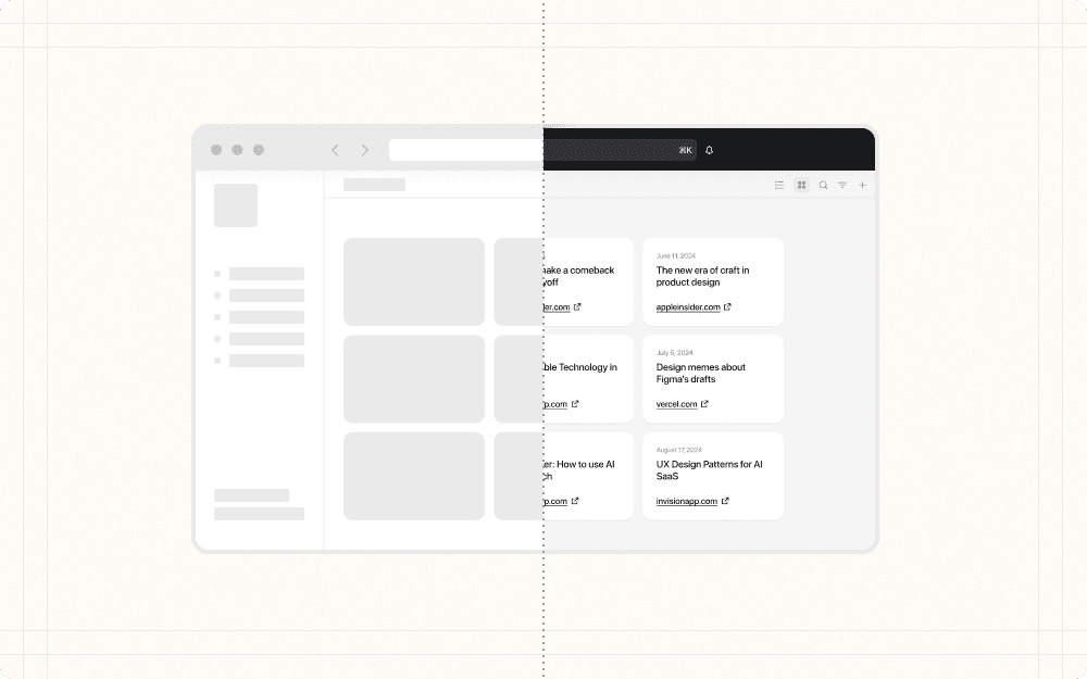
Step 6: Enhance the fidelity
Once you have a set of promising design concepts, it's time to refine the details and enhance the fidelity of your designs. This involves adding visual polish, interactive elements, and content to create a more realistic prototype.
Key considerations
Choose areas to improve fidelity.
Start with the most important or frequently used parts of the interface, such as the main dashboard or primary user flows.
Prioritize areas that have the greatest impact on user understanding, like key call-to-action buttons or data table interactions.
Consider using progressive disclosure to reveal complexity gradually. For example, start with a simplified view and allow users to expand or access more advanced actions or content as needed.
Refer to the checklist for improving fidelity to help you prioritize which parts of your design to enhance.
Go deep.
Identify the key screens or flows to flesh out in higher fidelity. For example, focus on the onboarding flow, main dashboard, or key user tasks like creating a new project or generating a report.
Incorporate visual design elements like color, typography, and imagery. Consider your brand guidelines and style to create visually engaging designs. Use color to highlight important elements, choose typography that is legible and matches the tone, and select imagery that enhances the experience.
Add interactive elements like hover states, transitions, and animations. Think about how elements like buttons, menus, and tooltips will respond to user interaction. Subtle animations can provide helpful feedback and guide the user. Transitions between screens can orient the user and maintain context.
Replace placeholder content with more realistic or actual content. Use real product names, descriptions, metrics, and imagery if available. Realistic content helps surface any issues with the design and makes the prototype feel more authentic for testing or demos.
Best practices
Balance visual polish with speed. Don't spend too long perfecting every pixel if there are still open questions about the overall design direction. The goal is to improve realism while maintaining efficient iteration.
Example
For Cluster, focus on refining the core content display and organization features before spending time on intricate animations or background patterns.
Use a design system if available. Leverage existing components, patterns, and styles to maintain consistency and accelerate the process. If no system exists, consider reusing components from other design ideas that haven’t made it to production.
Example
Create a basic component library for Cluster with common elements like buttons, input fields, and content cards. This will help maintain consistency as you enhance fidelity across different screens.
Work collaboratively. Review the higher fidelity designs with cross-functional partners like engineering, product, and leadership to get input, identify feasibility issues, and build shared understanding of the intended experience early.
Example
Share your enhanced designs for Cluster's AI summary feature with the engineering team to ensure the proposed visualizations are technically feasible.
Know when to explore divergent ideas vs. refine details. If larger UX problems emerge while adding fidelity, be willing to take a step back and rapidly explore alternative approaches before getting too invested in a single direction.
Example
If user testing of the higher fidelity prototype reveals that users are struggling with the content organization system, be prepared to revisit and iterate on this core feature rather than focusing on visual polish.
