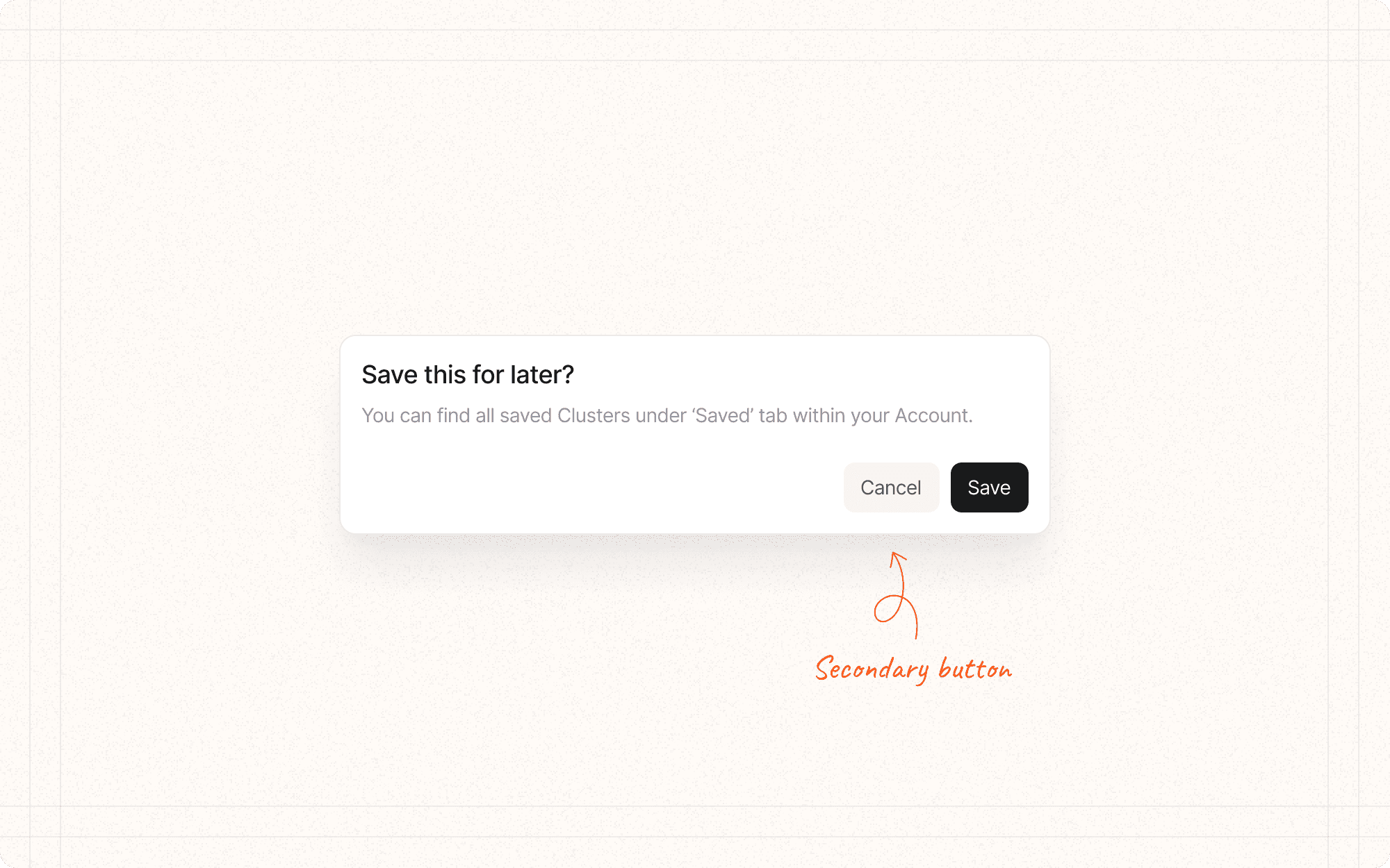
Secondary interactions are less frequently used or supporting actions within an interface. Designing secondary interactions requires a balance between discoverability and simplicity.
What are the secondary interactions in your interface?
How are secondary interactions progressively disclosed to avoid overwhelming the user
Example: In Cluster, options for editing a content item's metadata could be hidden behind an "Edit" button or menu.
What visual cues (e.g., tooltips, icons, microcopy) are used to indicate the presence of secondary interactions?
Are secondary interactions easily accessible when needed?
Example: In Cluster, the option to archive a content cluster might be a secondary action, accessible through a dropdown menu or icon in the cluster view.
Group related secondary interactions together.
Example
In Cluster, group all content editing actions (rename, move, delete) in a single dropdown menu within the content item view.
Use progressive disclosure techniques (e.g., hover reveals, toggles, menus) to hide complexity.
Provide clear affordances and labeling for secondary interactions
Example
Use a consistent icon (like three dots "...") throughout Cluster to indicate the presence of additional options.
Ensure secondary interactions don't compete visually with primary interactions.
Use consistent patterns for secondary interactions across the interface.
Example
If Cluster uses a gear icon for settings in one area, maintain this convention throughout the app.
Consider the frequency of use and importance when designing the accessibility of secondary interactions.
