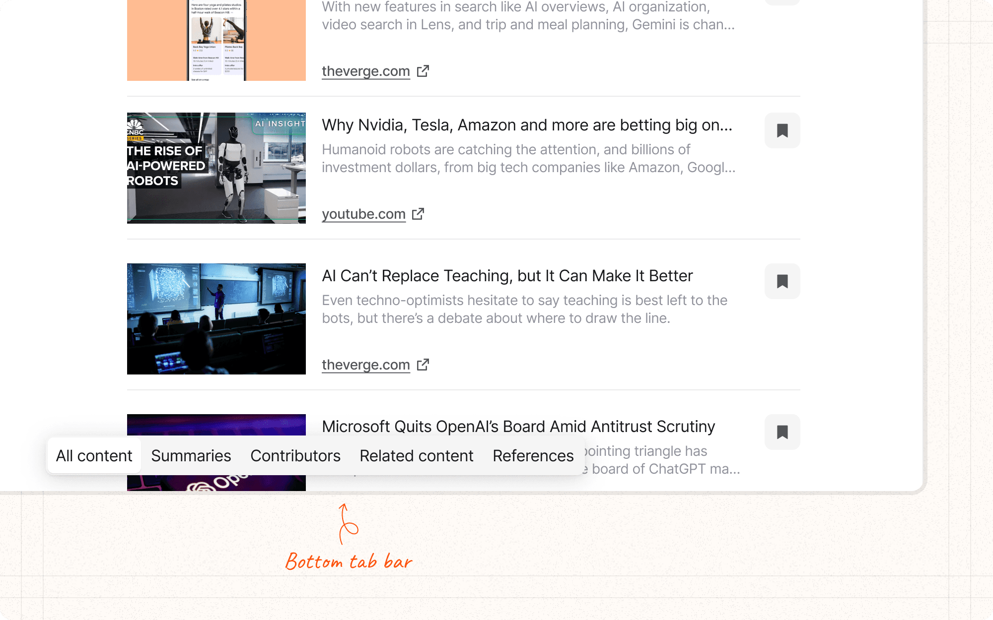
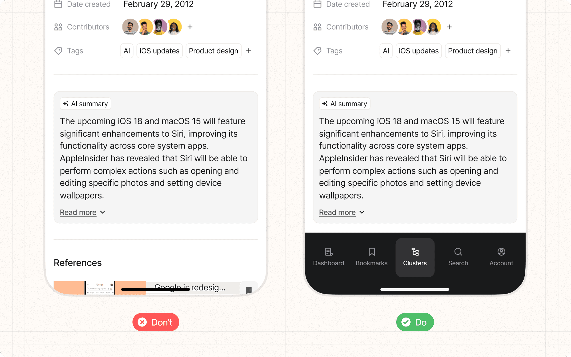
Bottom navigation
Bottom navigation is a mobile-first design pattern that places primary navigation items at the bottom of the screen, typically in a bar with icons and labels. This pattern is particularly effective for mobile applications, where it provides easy thumb access to key features.
Benefits and Use Cases
Improves one-handed usage. Placing navigation at the bottom of the screen makes it easier to reach with thumbs on larger mobile devices.
Example
In Cluster's mobile app, use bottom navigation for primary actions like "Home," "Projects," "Create," and "Notifications."
Enhances visibility of key features. Bottom navigation keeps important actions constantly visible and accessible.
Example
Include a "Quick Add" button in the center of Cluster's bottom navigation for rapid content creation.
Supports task switching. Users can easily switch between main sections of the app without reaching to the top of the screen.
Example
Allow Cluster users to quickly toggle between "My Work," "Team," and "Analytics" views via bottom navigation.
Provides clear navigation structure. Bottom navigation clearly communicates the main sections or features of the app.
Example
Use distinct icons and labels in Cluster's bottom navigation to represent different content types like "Articles," "Images," and "Videos."
Psychological Principles Supported
Fitts's Law. Bottom navigation minimizes the distance and effort required to reach key functions, especially on mobile devices.
Example
Place Cluster's most frequently used features in the bottom navigation, reducing the time and effort needed to access them.
Recognition over Recall. Icons and labels in bottom navigation help users quickly recognize and access main features without having to remember their location.
Example
Use clear, universally recognized icons in Cluster's bottom navigation, such as a house for "Home" or a bell for "Notifications."
Chunking. Bottom navigation naturally chunks the main sections of the app, making it easier for users to understand and remember the app's structure.
Example
Group Cluster's features into 3-5 main categories in the bottom navigation, helping users mentally organize the app's functionality.
Implementation Guidelines
DON'T
Overflow bottom navigation with too many items; use other patterns like "More" menus for additional options
Hide the bottom navigation on scroll, as it should remain accessible
Use bottom navigation for desktop interfaces where it's not a common pattern
Forget to provide appropriate touch target sizes for each navigation item
Neglect to consider how the bottom navigation interacts with other interface elements, like floating action buttons or keyboards
DO
Limit bottom navigation to 3-5 items for optimal usability
Use clear, recognizable icons alongside short labels
Ensure the active state is clearly indicated
Consider using a larger, central button for the primary action
Maintain consistency in bottom navigation across different screens


