Minimalist navigation
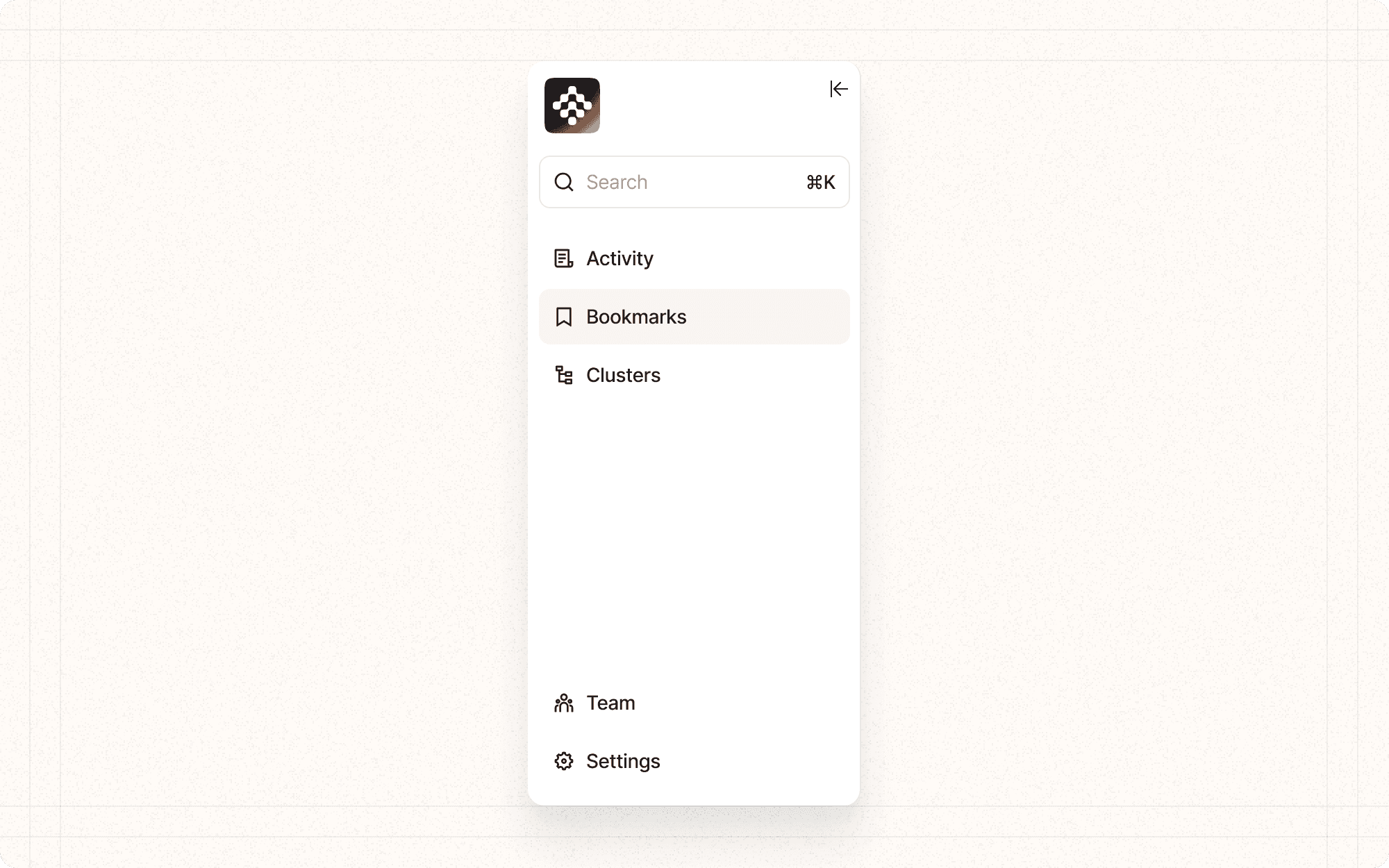
Minimalist navigation is a design approach that simplifies the navigational structure of an interface, presenting only the most essential options to users. This pattern aims to reduce cognitive load by limiting choices and focusing user attention on key tasks or content.
Benefits and Use Cases
Reduces decision fatigue. By limiting navigational choices, users spend less mental energy deciding where to go.
Example
In Cluster's main interface, use a minimalist top navigation with only essential sections like "Dashboard", "Projects", "Team", and "Settings".
Focuses user attention. A simplified navigation structure helps guide users to the most important areas of the application.
Example
In Cluster's content editor, minimize navigation options to focus user attention on the writing and editing process.
Improves mobile usability. Minimalist navigation is particularly beneficial on smaller screens where space is limited.
Example
For Cluster's mobile interface, use a bottom navigation bar with only the most crucial options, hiding less frequently used features in a menu.
Enhances learnability. With fewer options to remember, new users can more quickly understand and navigate the interface.
Example
In Cluster's onboarding process, introduce new users to a simplified navigation structure, gradually revealing more advanced options as they become familiar with the platform.
Psychological Principles Supported
Hick's Law. This principle states that the time it takes to make a decision increases with the number and complexity of choices. Minimalist navigation reduces choices, speeding up decision-making.
Example
In Cluster's project view, limit the primary navigation options to essential actions like "Edit", "Share", and "Analyze", reducing the time users spend deciding what to do next.
Cognitive Load Theory. By presenting fewer navigation options, minimalist design reduces the amount of information users need to process, lowering cognitive load.
Example
In Cluster's analytics dashboard, use a minimalist sidebar navigation to organize different types of reports, making it easier for users to find and focus on the data they need.
Signal-to-Noise Ratio. Minimalist navigation improves the signal-to-noise ratio by emphasizing important elements (signal) and reducing distractions (noise).
Example
In Cluster's content creation interface, minimize navigation elements to emphasize the content editor, reducing distractions and helping users focus on their writing.
Implementation Guidelines
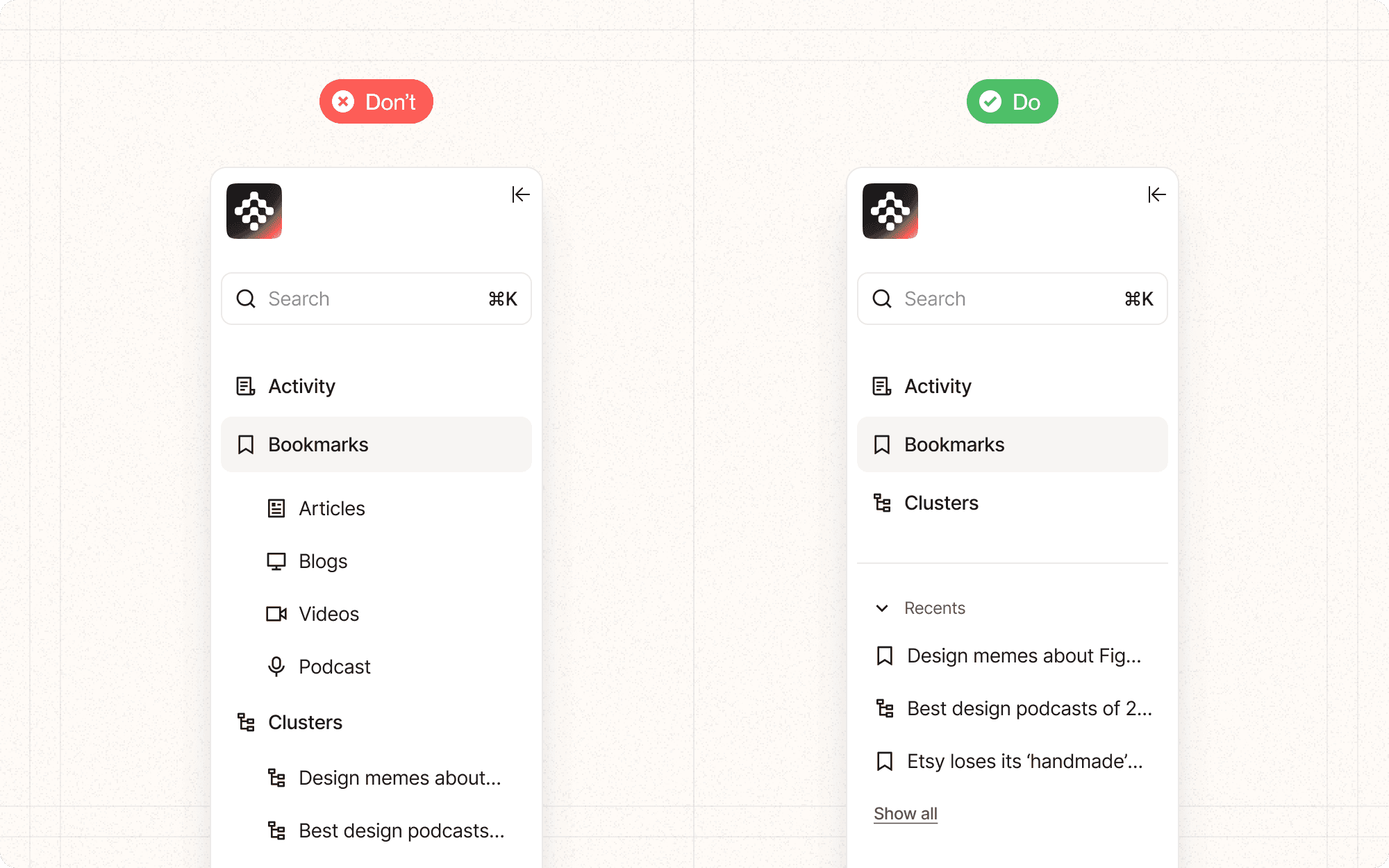
DON'T
Oversimplify to the point of obscuring necessary functions
Use ambiguous icons without labels, which can confuse users
Neglect to provide a way to access less frequently used but still important areas
Apply minimalist navigation uniformly across all user types if advanced users need quick access to more options
Forget to user test your minimalist navigation to ensure it meets user needs and expectations
DO
Prioritize the most important and frequently used navigation items
Use clear, concise labels for navigation options
Consider using icons alongside or instead of text for navigation items, especially on mobile
Provide easy access to a more comprehensive navigation menu if needed
Ensure that all key areas of the application are still accessible, even if through secondary navigation


