Icons are visual symbols that represent actions, objects, or concepts in a user interface. When used effectively, they can enhance usability by providing quick visual cues, saving space, and transcending language barriers.
What style of icons (e.g., outlined, solid, illustrated) best fits the overall design aesthetic?
Consider how the icon style aligns with your brand and other visual elements.
Example: For Cluster, use a consistent set of outlined icons with a uniform stroke weight to maintain a clean, modern look.
How can we ensure icons are consistent, recognizable, and communicate their intended meaning?
Think about the clarity and universality of the icons you choose.
Example: In Cluster, use widely recognized icons for common actions (e.g., a gear for settings, a plus sign for adding content) to ensure immediate understanding.
What size and color treatment will make the icons effective across different contexts?
Consider how icons will appear in various sizes and color schemes.
Example: Design Cluster's icons to be legible at multiple sizes, from small toolbar icons to larger feature illustrations.
How will icons contribute to the overall visual hierarchy and user flow?
Use icons to guide users through the interface and highlight important actions.
Example: In Cluster's main navigation, use slightly larger, colored icons for primary sections to differentiate them from secondary menu items.
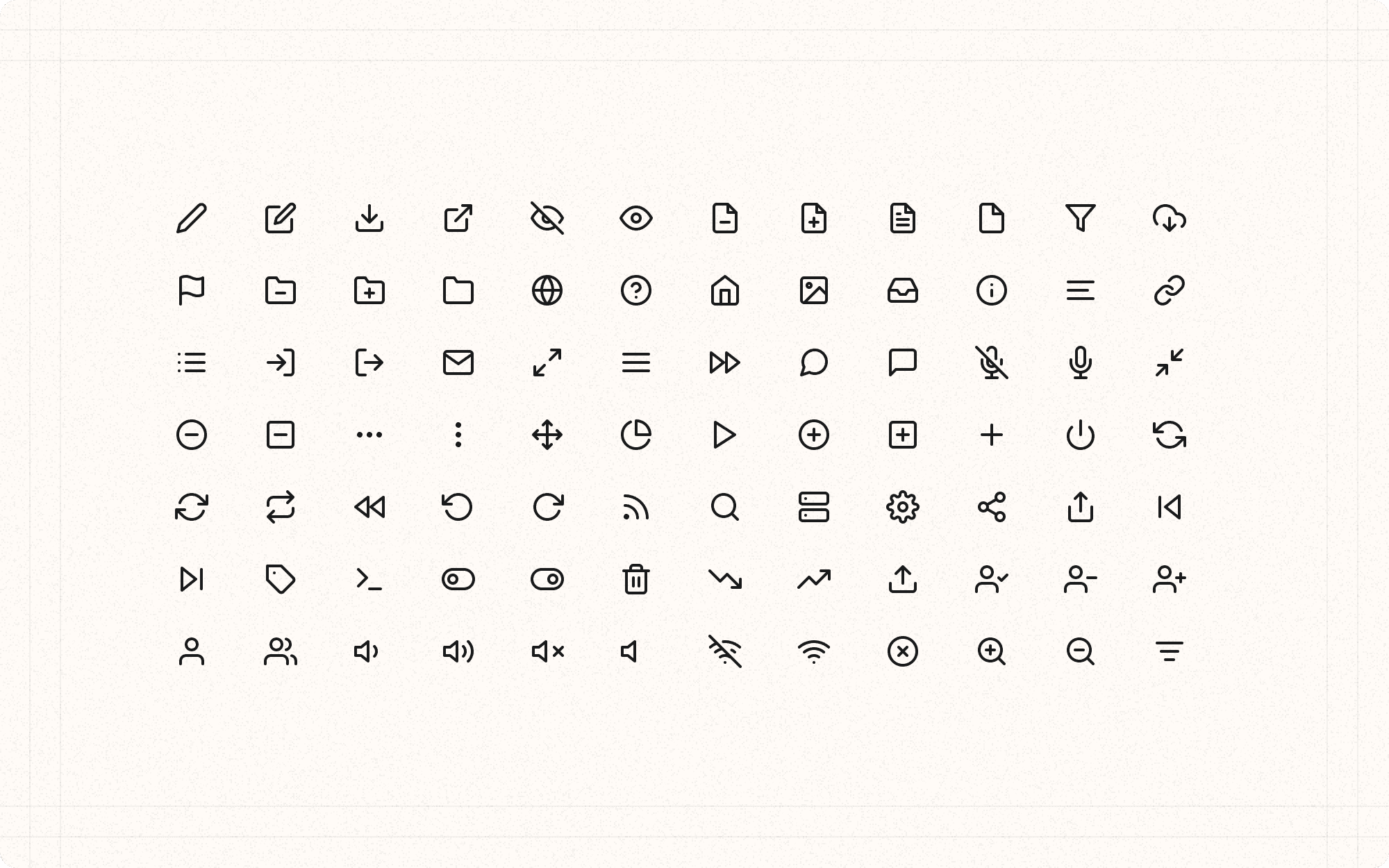
Maintain consistency in style, size, and color across your icon set.
Example
Ensure all of Cluster's interface icons have the same stroke weight, corner radius, and general style to create a cohesive look.
Use familiar, universally recognized icons for common actions.
Example
In Cluster, use a magnifying glass for search, a bell for notifications, and a user silhouette for profile actions.
Provide text labels alongside icons, especially for less common actions.
Example
In Cluster's content editor, include text labels with icons for specialized functions like "Generate AI Summary" or "Export to PDF" to ensure clarity.
Ensure icons are scalable and look good at different sizes.
Example
Design Cluster's icons as SVGs to maintain quality at any size, from small mobile menu icons to large feature illustrations.
Use color in icons purposefully to draw attention or convey meaning.
Example
In Cluster, use the primary orange color for icons related to creating or generating content, helping these actions stand out.
Consider cultural differences when choosing icon metaphors.
Example
If Cluster expands globally, research and potentially adapt icons that might have different meanings in various cultures.
Use icons to reduce cognitive load and simplify complex concepts.
Example
In Cluster's analytics section, use simple chart icons (bar graph, pie chart, etc.) to represent different types of data visualization options.
Ensure sufficient contrast between icons and their backgrounds.
Example
In Cluster's dark mode, adjust icon colors or add subtle outlines to maintain visibility against darker backgrounds.
Use animation sparingly to enhance icon functionality.
Example
In Cluster, animate the "Save" icon (e.g., a subtle checkmark animation) to provide feedback when a user saves their work.
Test icons for accessibility, including with screen readers.
Example
Provide clear, descriptive alt text for all icons in Cluster to ensure they're understood by users relying on assistive technologies.