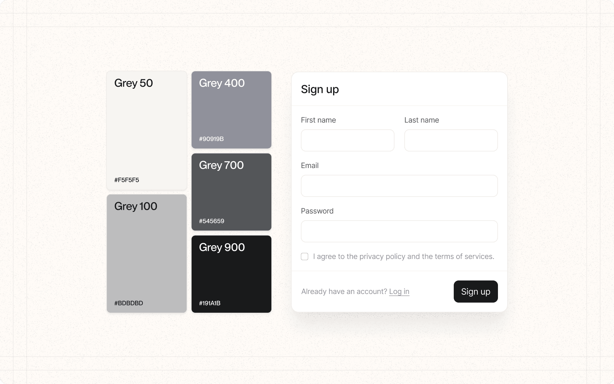
Color is a powerful tool in visual design that can evoke emotions, guide attention, and communicate meaning. When used effectively, color can enhance usability, reinforce brand identity, and create a visually appealing interface.
What color scheme (e.g., monochromatic, complementary, triadic) aligns with the brand and evokes the desired emotional response?
Consider the psychological impact of different color combinations.
Example: For Cluster, use a primarily monochromatic scheme based on the brand's orange, with complementary blacks for accents and calls-to-action.
How can we use color to create contrast, guide attention, and convey meaning?
Determine how color can be used functionally within the interface.
Example: In Cluster, use the primary orange color for important actions like "Create New Cluster" or "Generate AI Summary" to draw attention.
How will the color choices impact accessibility and readability?
Ensure sufficient color contrast for text and important UI elements.
Example: Maintain a contrast ratio of at least 4.5:1 for normal text and 3:1 for large text in Cluster's interface, particularly for text on colored backgrounds.
How will the colors appear across different devices and in various lighting conditions?
Consider how colors may shift on different screens or in different environments.
Example: Test Cluster's color scheme on various devices and adjust if necessary to ensure consistency and readability.
Establish a clear color hierarchy and use it consistently.
Example
In Cluster, use the primary orange for main actions, a secondary color for less important actions, and neutral colors for most of the interface.
Limit the number of colors in your palette to maintain visual coherence.
Example
Stick to a core palette of 3-5 colors for Cluster, with variations in shade and tint as needed.
Use color to differentiate between interactive and static elements.
Example
In Cluster, use color to clearly distinguish clickable elements like buttons and links from non-interactive text.
Consider creating both light and dark themes for your interface.
Example
Develop a dark mode for Cluster that inverts the color scheme while maintaining readability and brand consistency.
Use color to convey status and feedback.
Example
In Cluster, use green for success messages, red for errors, and yellow for warnings consistently throughout the interface.
Ensure your color choices work for users with color vision deficiencies.
Example
Use tools like Stark or Color Oracle to simulate how Cluster's interface appears to users with different types of color blindness, and adjust if necessary.
Use color to group related elements and create visual separation.
Example
In Cluster's dashboard, use subtle background colors to visually separate different sections or types of content.
Be mindful of cultural associations with colors.
Example
If Cluster expands globally, research color meanings in different cultures and adjust the color scheme for specific markets if necessary.
