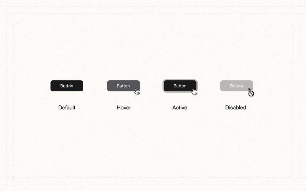
Component states refer to the different visual representations of a UI element based on user interaction or system status. Properly designed states provide clear feedback and help users understand the current state of the interface.
Identify the different states for each component
Have I considered the default, hover, active, and disabled states for each interactive component?
Are there any additional states specific to my application that I need to account for?
Define the visual changes for each state
How can I visually differentiate each state to provide clear feedback to users?
Can I use changes in color, opacity, border, or shadow to indicate different states?
Do the visual changes align with the overall design system and maintain consistency across components?
Ensure state transitions are smooth and responsive
Are the transitions between states smooth and not jarring to users?
Do the transitions provide a sense of interactivity and responsiveness?
Have I considered using subtle animations or transitions to enhance the user experience?
Test the component states across different devices and screen sizes
Do the component states maintain their visual clarity and usability across different devices and screen sizes?
Are there any adjustments I need to make to ensure consistency and readability on various devices?
Use distinct and consistent visual cues for each state (e.g., color, opacity, shadows).
Example
In Cluster, use a consistent color shift for hover states across all buttons, such as darkening the button color by 10%.
Provide hover states for all interactive elements.
Example
In Cluster's content list view, show a subtle background color change when hovering over individual content items to indicate they're clickable.
Ensure disabled states are visually distinct and communicate a lack of interactivity.
Example
For Cluster's "Generate AI Summary" button, use a muted color and remove the hover effect when there's no content selected, clearly indicating it can't be used.
Consider using subtle animations or transitions to enhance state changes.
Example
When a user clicks the "Add to Cluster" button in Cluster, use a quick (200-300ms) scaling animation to provide visual feedback of the action.
Maintain consistency in state design across similar components.
Example
Ensure that all action buttons in Cluster (like "Create," "Edit," "Delete") have the same visual treatment for their respective states.
Use appropriate contrast ratios between states to ensure visibility for all users.
Example
In Cluster's dark mode, ensure that the active state of toggle switches has sufficient contrast against the background for better accessibility.
Implement clear focus states for keyboard navigation.
Example
In Cluster's search functionality, use a prominent outline or glow effect to indicate which search result is currently focused when using keyboard navigation.
